Consider the economic wellbeing of South Africa and Ukraine in 2003. South Africa’s mean income at $10,400 was 67% higher than Ukraine’s at only $6,220 but Ukraine’s life expectancy was 67.4 years which is 25% higher than in South Africa at 53.7 years according to Gapminder’s data.
Richer countries usually have higher life expectancy, so it is amazing that Ukraine achieved much higher life expectancy despite much lower income. The best explanation for this conundrum is the fact that Ukraine had much lower inequality. The Gapminder graph below compares the 2003 income distribution in Ukraine (yellow) and South Africa (blue). Both nations had about the same population (45m) which means that the area under each curve is identical, but South Africa’s income was much more spread out due to much higher inequality. Thus, South Africa had a much bigger problem with extreme poverty, defined as earning less than $1.85 per day despite having a much higher mean income.

Note that the horizontal axis is on a log scale which gives these populations the appearance of being normally distributed because Gapminder estimates the income distribution curves by simply assuming that the income distribution is lognormal for every nation and expressing the width of the curve by using published estimates of inequality. The income distribution is almost always lognormally distributed for everyone except the richest 2% of the population, so this is a reasonable assumption. Gapminder is also implicitly estimating the median income for every nation because the peak of a lognormal bell-curve is the median. You can see on the above graph that Gapminder estimates that the median income in Ukraine was a bit bigger than in South Africa despite being much poorer in aggregate because of having fewer wealthy people. Unfortunately, we don’t have direct measurements of median income for the two nations, so the kind of estimates that Gapminder did are as good as it gets.
It is usually remarkably accurate to assume that the income distribution is lognormal, but in the case of South Africa, there were really two separate economies under apartheid which created a bimodal distribution because it was like a stack of two different lognormal distributions, one for whites and one for blacks. I don’t have good enough data for South Africa to show the dynamics, so I’ll show a similar example by using Gapminder data for the income distribution in Sudan (blue) and Saudi Arabia (red):
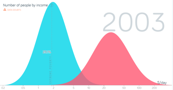 If these two neighbors merged across the Red Sea into one nation the result would look a bit like South Africa. Because the two economies would not be fully integrated, a binomial distribution would be the result as displayed in the graph below where the two distributions are stacked with the Saudi plopped on top of Sudan.
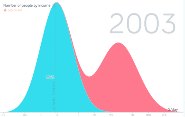
The merged country would have a single color and look like this:

Similarly, if you look at other social indicators for South Africa, like educational achievement, you get a similar bimodal distribution with two peaks.


Leave a Comment