Dylan Matthews compiled a lot of data about the 2014 election including this graph of voter income:
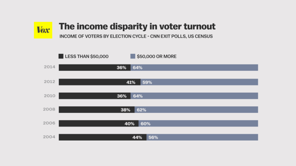
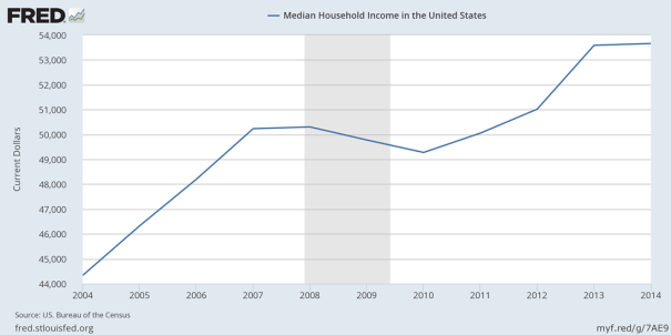
Unfortunately, he didn’t divide up the graph according to median income. That would give a more meaningful comparison because we could see what share of voters is richer than the median and what share is poorer and we could tell if the median voter is getting richer or not. But this graph is pretty close to that because median household income averaged close to $50,000 during these elections, so it does give a pretty good idea how much richer the median voter is than the median American. For example, in 2010, the median household income was $49,276, and over 64% of voters earned more than that.
Poorer people don’t vote as often as richer people. This is one reason government policy is skewed away from Americans below the average income. The other reason is that national politicians have spent most of their adult lives in households that earn far above the median income and they predominately hang out with people in the upper third of the income distribution. That is one reason they seem so out of touch with most Americans. They don’t have much connection with Americans below the median income.


Leave a Comment