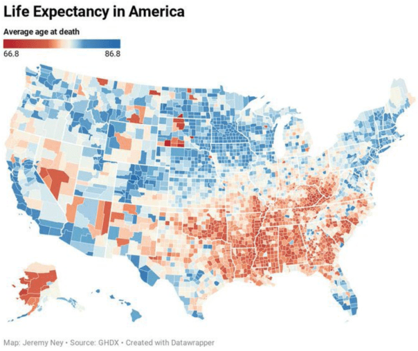
We read a lot about the growing political divide in America and we hear a lot of commentary about the two Americas in terms of income inequality. But a bigger inequality problem is the gap in life expectancy. Here’s a map of life expectancy at birth:
It is hard to claim that there is equal opportunity in America when there is a gap of over 20 years in life expectancy between counties in the US.
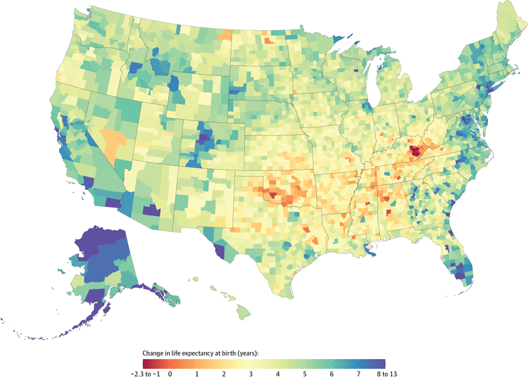
Also, inequality in life expectancy been getting worse in many of these areas. The following map from JAMA shows where life expectancy got better between 1980 and 2014 (in blue) or got worse (in red). Generally speaking, the worst areas are Native American reservations and the Upland South (an area that strongly swung towards the Republican Party in 2008), whereas the Atlantic South and most urban counties saw improvements:
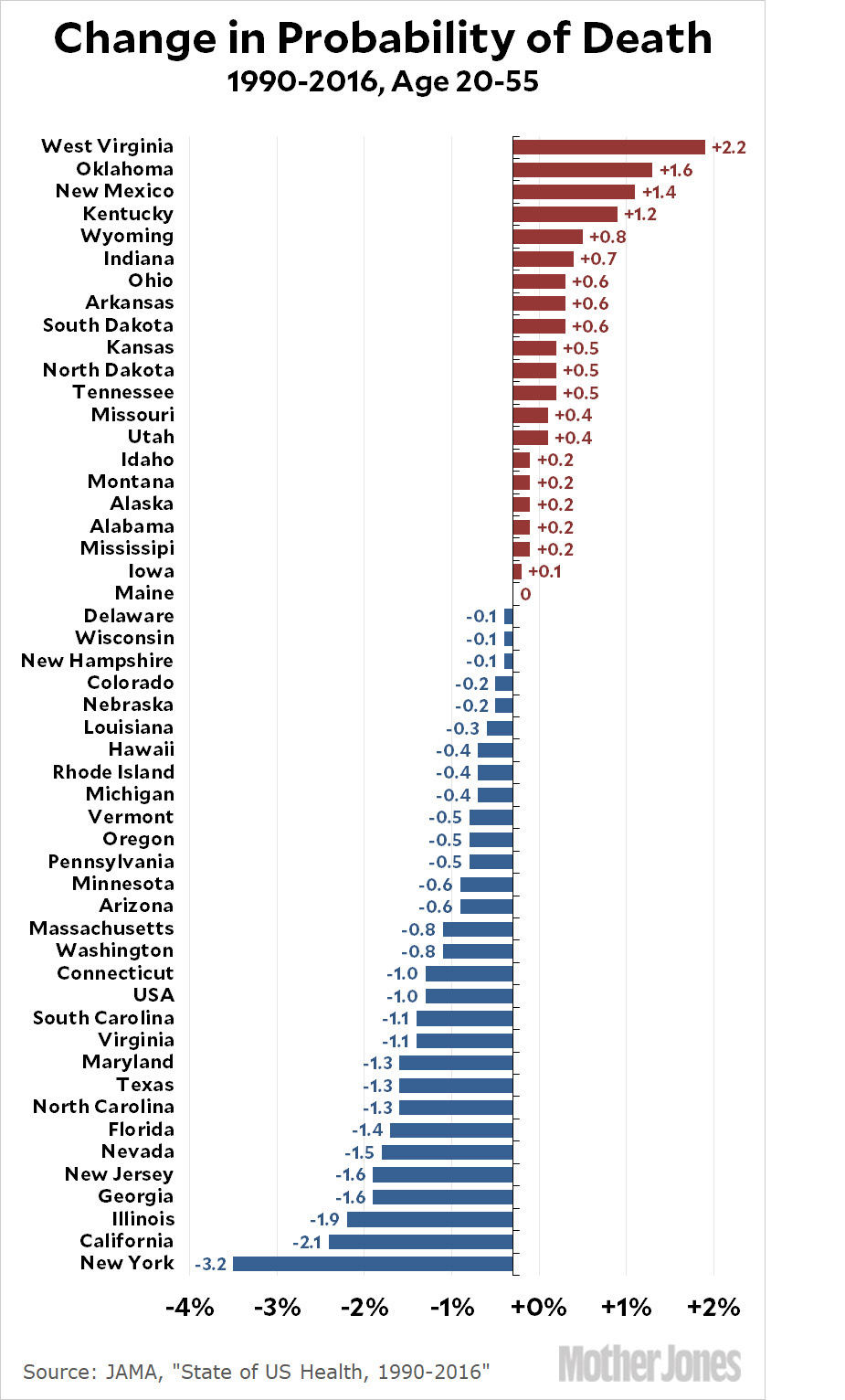
In general, the healthiest areas have been getting healthier and many of the worst areas have been falling further behind. At a state-by-state level, the following graph shows which states have been getting healthier (in blue) and which states have been backsliding (red).
The fall in life expectancy in the red areas is so bad that it has been dragging down average life expectancy in the US overall for the past three years in a row. This is the biggest crisis in American life expectancy in a century.
The nation is in the longest period of a generally declining life expectancy since the late 1910s, when World War I and the worst flu pandemic in modern history combined to kill nearly 1 million Americans. Life expectancy in 1918 was 39. Aside from that, “we’ve never really seen anything like this,” said Robert Anderson, who oversees CDC death statistics.
Unlike a century ago, this time around few of our national political leaders seem to care. This is why we need better statistics of economic well being like MELI that incorporate life expectancy. Politicians care more about GDP than about life expectancy even though life expectancy is much more important for wellbeing, especially in a rich country where the marginal value of a little more money has a smaller effect on wellbeing than the marginal value of a longer, healthier lifespan.
And it gets even worse than that if we compare neighborhoods in our cities which have even starker inequality. For example, there is a 30-year difference in life expectancy between the stylish Streeterville neighborhood in Chicago where my wealthy gay uncle used to live and the impoverished Englewood neighborhood where my wife used to do social work. They are only eight miles apart geographically, but worlds apart in every other respect. Median income is $104,000 in Streeterville vs. $21,000 in Englewood.
The decline in life expectancy is mainly affecting people who earn less than the median income as I wrote about earlier. Here is the relationship between life expectancy and economic class:
Richer people live longer and the gap in life expectancy has been steadily growing. The following graphs show how much the gap rose over just 13 years:
Although Americans above the median income have similar life expectancy no matter where they live, life expectancy among lower-income Americans varies widely from place to place. Rich Americans have similar life expectancy no matter where they choose to live, but because of the variance in life expectancy among the poor, some regions, like Detroit, have much greater inequality in life expectancy than other areas, like New York City.
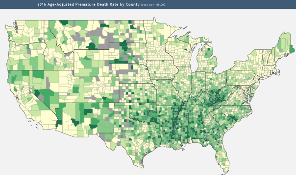
Now if you compare the mortality rates in the above map with the following map counties with big urban populations where the darker counties have cities. The high-population counties with cities generally have lower mortality on the above graph than rural counties.
The gap in mortality rates is also increasing between college graduates (basically the top 30% most educated as represented by the orange line below) who continue to progress and high-school dropouts who are in trouble (the black line showing the rising mortality of the bottom 10%). Vox explains:
An October 2018 working paper out of Dartmouth College sliced the mortality data along lines of education and found a similar trend. Researchers looked at the rising mortality among middle-aged, non-Hispanic whites by education status. The rise, they discovered, is almost entirely driven by the least-educated 10 percent of the population, while the most educated among us are seeing their mortality rates go down:
“Like the poor, the least educated experience a range of socioeconomic disadvantages,” the researchers, Paul Novosad and Charlie Rafkin, wrote, “such as high unemployment, low insurance coverage, poor nutrition, and exposure to harmful environmental factors.”
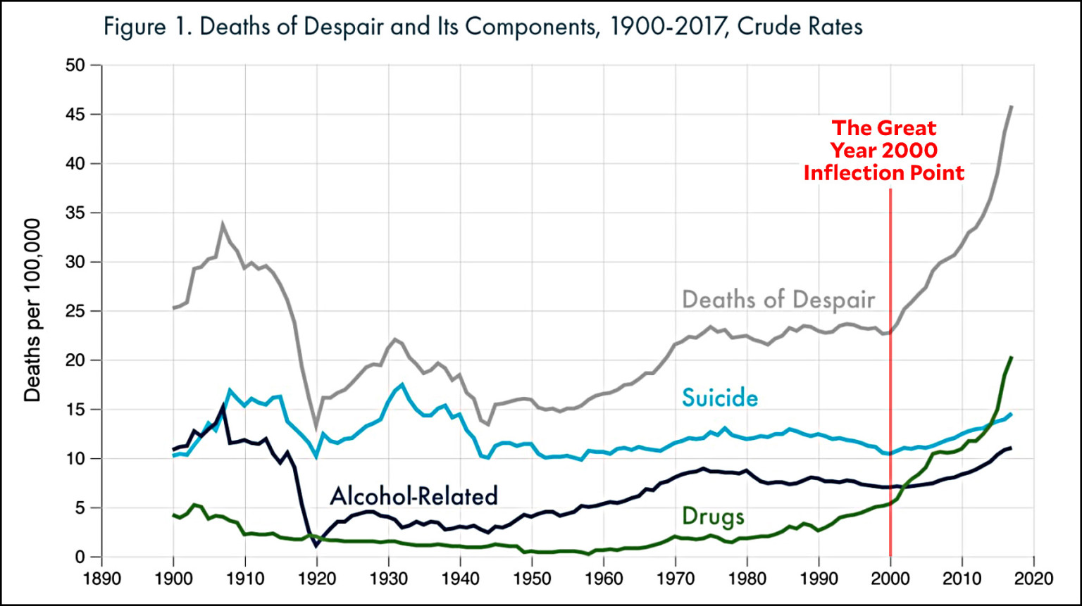
White mortality due to what Deaton calls “deaths of despair” have almost tripled in the US. These deaths are caused by suicide, alcohol/drug deaths, and heart disease. In a way, they are all diseases of broken hearts.
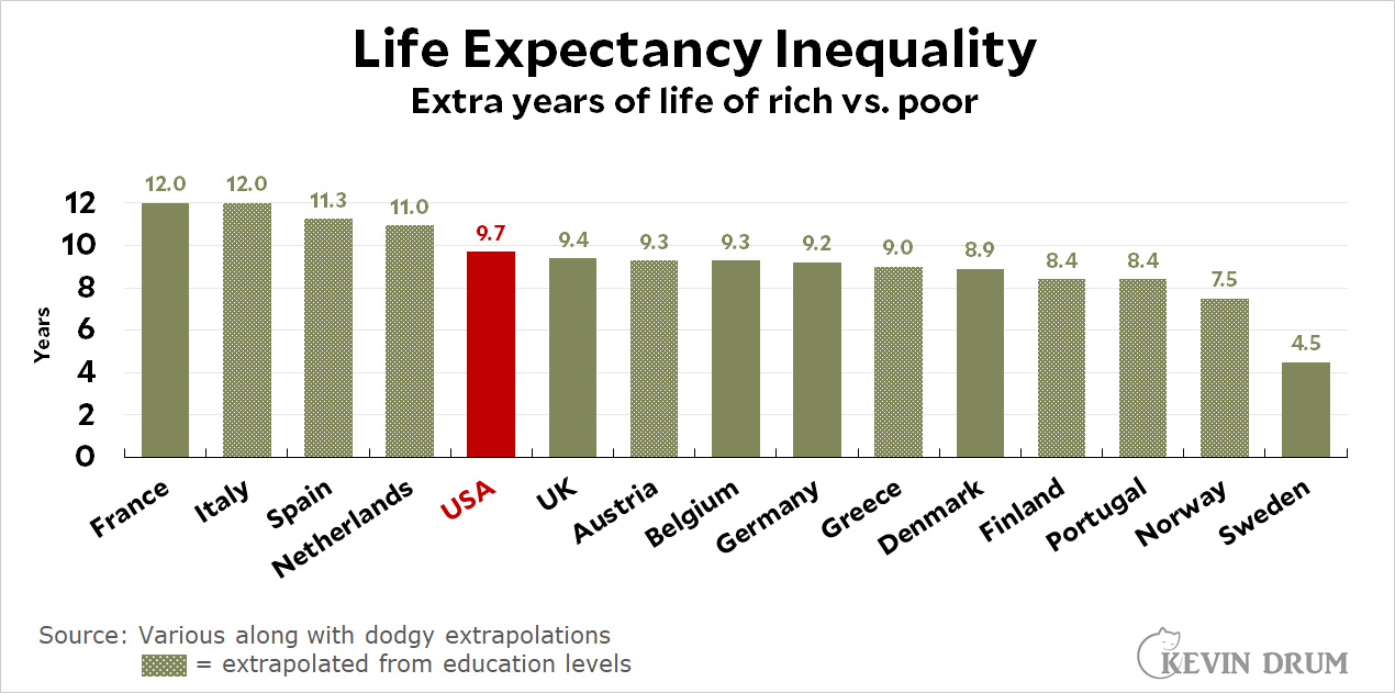
Deaths of despair are not spiking in other industrialized nations. The recent rise in mortality is peculiar to America even though other nations also have inequality in life expectancy that is similar to that in the USA:
The big difference between America and all other rich nations is not the inequality of life expectancy, but much worse life expectancy for ALL Americans relative to other rich nations.
Before 1960, the US had longer life expectancy than most rich nations, but today, they have all surpassed us. The gap between the US and all other rich nations can be explained by many factors that are avoidable and tragic such as higher homicides, car wrecks, drug overdoses, and worse treatment of chronic diseases like diabetes. Americans would be happier and healthier if we could reduce these problems. America’s life expectancy gap is also partly due to higher obesity and it is less clear whether Americans would be happier if we ate less fattening foods, but there are many areas that America could improve without reducing our pleasures.
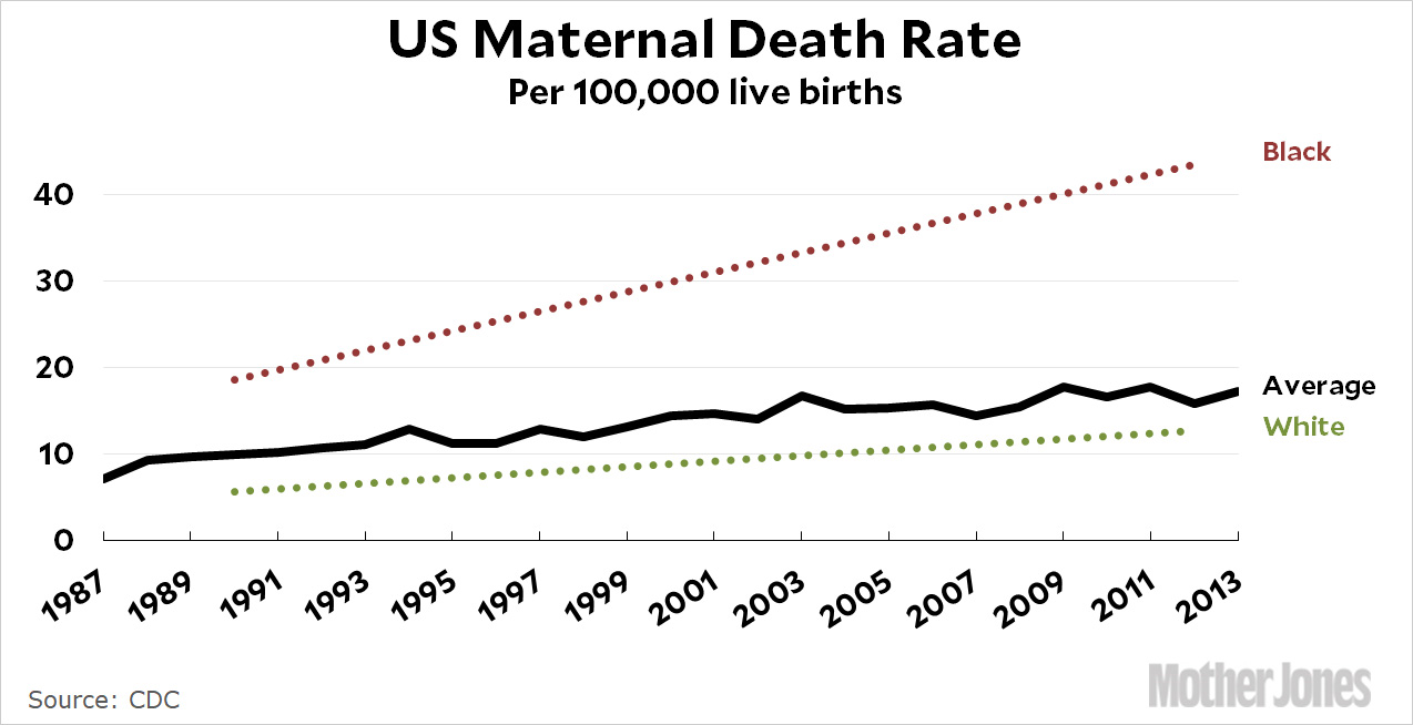
One of the preventable ways American health is getting worse is mothers dying during childbirth more frequently than in the past. America had one of the best records for maternal health in the world from the 1950s through the 1970s, but progress in America ended in 1979 and since then the US maternal mortality rate has gotten worse whereas nearly all other nations on earth have improved. Even North Korea has improved its maternal mortality rate since 1979. Meanwhile, the US has gotten worse–so bad that the US is now worse than any other industrialized nation. American moms are dying at ever worse rates!
The mortality rate of American moms has more than doubled in the past 20 years and is continuing to rise. Those are healthy young women in their prime. This should be considered a crisis folks!
UPDATE:
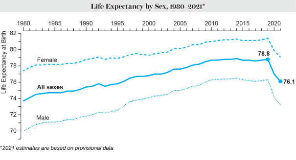
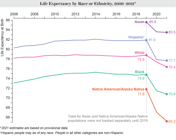
Although there was a tiny uptick in life expectancy from 2018-2019, it only barely made up for lost ground and brought American back to about where we had been in 2014, so don’t celebrate yet. And then Covid hit which wiped out 26 years of progress in 2020-2021:
Unfortunately, it is hard to find data about life expectancy by economic class. America is much more interested in examining racial gaps (most of which have generally been improving when holding class constant) and because race is correlated with class in America, we can see that the inequality in life expectancy was likely exacerbated by Covid:
Here we can see that there is an inverse correlation between the drop in life expectancy and the richest racial groups. Asians are the richest and their life expectancy drops the least. Whites are the next richest and they have the second smallest drop. Then Hispanics and Blacks and at the very bottom, Native Americans are the poorest and had the biggest drop in life expectancy. (Note that Hispanics have a longer life expectancy than Whites even though Hispanics are poorer on average, so money is only one determinant of life expectancy and Hispanics have something else going on too.)
Inequality of life expectancy is not inevitable. In fact, the richest elites of the British nobility used to have shorter life expectancy than their impoverished subjects! For many centuries, wealthy people didn’t have longer lives because they didn’t know how to use their money to buy longer lives, but due to the last two centuries of scientific progress, an educated person with money can now enjoy lots of things that extend lifespan that have escaped the reach of poorer citizens.
For example, there has been a plethora of new pharmaceuticals invented in the past 15 years that are effective at saving lives but at astronomical prices.
Researchers for Brigham and Women’s Hospital in Massachusetts found that the median price of a new drug was around $180,000 in 2021, up from $2,100 in 2008. Those high prices are a factor in a stark wealth gap in medical outcomes. Dr. Otis Brawley, a professor of oncology and epidemiology at Johns Hopkins University, points to cancer, where the death rate for Americans with college educations, a proxy for wealth, is 90.9 per 100,000 per year. For those with a high school education or less, the rate is 247.3
…Today’s ultraexpensive drugs include not just new medications, like Mavenclad, the multiple sclerosis drug that Ms. Crawford needs, but also older medications that drug companies have hiked the prices of in the last few decades.
One example is Revlimid, which treats blood cancers. Its sticker price is three times as high as it was when first introduced in 2005.
One study found that when insured patients faced co-payments for drugs that hit over $2,000, about half of the patients don’t pick up the drugs. The poorer half of patients are more likely to skip their medications and die younger.
[…] need more. They should need less because wealthy people are healthier and live longer than the median American. I suspect that nobody complains about the moral hazard of the wealthy because the warped […]
[…] planning longevity calculator and if anything, longevity has tended to increase over time (until the crisis of the last three years in the USA), so the period life expectancy has consistently underestimated actual cohort life expectancy for […]
[…] expectancy. Less educated Americans haven’t given it up which has contributed to increasing inequality of life expectancy between the rich and the poor in America. Whereas impoverished people used to live longer than […]


[…] This map is also quite similar to the maps showing where Americans have low (and decreasing) life expectancy. […]
[…] Better luck in love is just one of many reasons to go to college. Another little-known reason is longer lifespan! […]
[…] need more. They should need less because wealthy people are healthier and live longer than the median American. I suspect that nobody complains about the moral hazard of the wealthy because the warped […]
[…] planning longevity calculator and if anything, longevity has tended to increase over time (until the crisis of the last three years in the USA), so the period life expectancy has consistently underestimated actual cohort life expectancy for […]
[…] is popular with older, rural, low-education voters who are slowly dying off, moving to cities, and getting […]
[…] expectancy. Less educated Americans haven’t given it up which has contributed to increasing inequality of life expectancy between the rich and the poor in America. Whereas impoverished people used to live longer than […]