When you get a 10% raise, will you suddenly need to spend 10% more on food and clothing?

Most Americans spend about the same percent of their income on clothing regardless of how much they earn. For example, people who earn $5,000 per year might spend about $200 on clothing whereas Americans who earn $150,000 per year spend roughly $6,000 of it on clothing! It is a strangely steady percentage. Housing and food are also remarkably steady.

This remarkably constant relationship doesn’t hold for historical data. The average American is much richer today than in 1901, and yet we spend less than a third as much of our budget on clothing now. The main reason is that the real price of food and clothing has dropped over the past century, so even though we now spend a lot less, we are buying a lot more of these goods.

The visualizations come from Catherine Mulbrandon at Visualizing Economics

Posted in Development, Globalization & International

Marc Andreessen wants to put teachers out of work but he doesn’t know what he is talking about

Vox posted a series of interviews with Marc Andreessen in which the billionaire co-founder of Netscape seems to feel that most of the economy outside of silicon valley is simply backwards.

…you have the sectors in which prices are rapidly rising: health care, education, construction, prescription drugs, elder care and child care. Here there’s very little technological innovation. Those are sectors with insufficient productivity growth, innovation, and disruption. … To me the problem is clear: The problem is insufficient technological adoption, innovation, and disruption in these high-escalating price sectors of the economy.

There might not be much technological innovation and disruption in elder care and education, but he is completely off base in talking about construction, health care, and prescription drugs. Real construction costs are about the same now as in 1980 despite rising wages because of better technology. The rising costs for construction is due to regulations that restrict the ability of landowners to build higher density, particularly in places like silicon valley. It is a bit ironic that the great innovators and disruptors of silicon valley have created a local government zoning monstrosity that caused a massive housing crisis there by banning the numerous simple construction technologies that could eliminate the problem. Jason Furman has research that the rise in housing costs is due to zoning restrictions, not construction costs:

Andreessen is also completely wrong about health care and prescription drugs. The rise in costs is not caused by a lack of innovation but exactly the opposite.  There has been tremendous innovation in healthcare and that innovation is a major cause of rising costs.  Nevertheless, despite the rising costs it is worth it. If there were no pharmaceutical innovation, then all our drugs would be cheap generics and we would spend almost nothing on drugs, but we wouldn’t have developed any new pharmaceuticals. We might not enjoy the money we would save on drugs because we would die earlier.

But the focus of Andreessen’s criticism is the education sector and it is understandable that he is particularly frustrated with the education market because he has been investing untold millions of dollars trying to ‘disrupt’ education for years and so far he has little to show for it. He says:

Primary education in the US is a monopoly. It’s a public sector monopoly with very little competition. …With higher education, at least there’s competition, but it’s a government-sponsored cartel. The structure of the cartel is accreditation and student loans, both of which are run by the government. So you have exactly the effects at the higher education level you’d expect to see from a cartel, which is the facade of competition but not really. The higher education market in the US, the traditional one, can’t adapt to increased demand. Any increase in money is just wealth transfers to the owners of these institutions. Many of which are the government. And therefore you get the student loan crisis, massive inequality, and the fact that there are only so many kids who can get a top-quality college education, and everyone else is confined to lower-quality schools. New technologies tend to vaporize on impact with those institutions. …Of course they don’t want to adopt new technology. It’s antithetical to the philosophy.

Andreessen doesn’t seem to have studied education very much. First of all, primary education is not a monopoly because it isn’t run by one federal system. Primary education is run by over 13,000 different independent local school districts plus thousands of private schools that compete with each other for students. One of the most important concerns for parents in choosing where to live is to pick a place near a good school.  They vote with their feet which creates a competition process known as Tiebout choice. Even in a rural area like Bluffton Ohio (population 4,000) where I live, I know many families who have moved here from nearby towns solely because they prefer Bluffton’s schools. I also know parents who drive their kids to another town to go to school. In urban areas there are many more options for choice and thus more competition than in rural areas like Bluffton. Economist Caroline Hoxby has empirically shown that metropolitan areas like Boston contain dozens of competing school systems within a 30-minute commute and she argues that this competition does indeed increase school quality relative to more monolithic school systems like Miami’s.

There are also over 30,000 private schools in the US which serve about 10% of primary school children. They compete intensely for the 5 million students they serve. Plus, there are nearly 2 million homeschooled students. What accounts for Andreessen’s business failure?  Seven million privately-schooled kids is an enormous market and he has failed to ‘disrupt’ them too. He can’t blame a government monopoly here.  He simply failed to disrupt private education just as badly as he failed to disrupt public education.

Finally, higher education is incredibly competitive for students, but it hasn’t led to greater efficiency.  Instead of leading to lower costs, competition is one of the main reasons college costs are so much higher in high-competition systems like the US compared with European higher education. Competition forces colleges to spend an ever increasing budget on recruiting students rather than on educating them in order to survive. The US higher education system is one of the most privatized and competitive in the world according to the OECD with only Japan and Korea being more privatized.  Here is the percentage of spending that is financed by private versus government sources and the US is third from the top. 

The fact that the US system is so privatized and competitive is one reason it is by far the most expensive system in the world.

The US university system also has also had a reputation for being the best in the world, but this is mainly because the elite American schools are fabulous.  There isn’t any evidence that the average college student learns more in American universities than in European schools.

Even though Andreessen is remarkably ignorant about the economics of the market he is trying to profit from disrupting, I hope his educational investments could eventually do some disrupting, but he is aiming at destroying the wrong market. He thinks he is going to put lots of teachers out of work and schools out of business, but I think if he is successful, he will actually put a lot of textbook publishers out of business. His MOOCs would work better to replace textbooks than teachers and once he figures out that the textbook market is the market he should be trying to disrupt, I think his chances for success will rise. The education textbook market has surprisingly little competition and rapidly rising prices, so it is ripe for disruption.

Andreessen shouldn’t blame his educational business failures on the backwardness of teachers.  The problem is that he hasn’t even been able to create better content than traditional textbook publishers so far, but I hope he succeeds.

UPDATE 5/2022:  Textbook prices are coming down, but I can’t see any evidence that Andreessen has had much to do with it.  I think the main reason is competition from open-source alternatives like OpenStax, Saylor.org, Khan Academy, and Lumen.  These kinds of organizations provide fantastic free textbooks and entire MOOCs that keep getting better and they are really disrupting the textbook publishing industry.  For example, I have examined many statistics textbooks and the best one for my students is an open-source text produced by Carnegie Mellon and reproduced for free by Lumen.  And Khan Academy’s free homework system is vastly superior to what Cengage has to offer.

Posted in Managerial Micro

Inequality in South Africa and Ukraine

Consider the economic wellbeing of South Africa and Ukraine in 2003. South Africa’s mean income at $10,400 was 67% higher than Ukraine’s at only $6,220 but Ukraine’s life expectancy was 67.4 years which is 25% higher than in South Africa at 53.7 years according to Gapminder’s data.

Richer countries usually have higher life expectancy, so it is amazing that Ukraine achieved much higher life expectancy despite much lower income.  The best explanation for this conundrum is the fact that Ukraine had much lower inequality. The Gapminder graph below compares the 2003 income distribution in Ukraine (yellow) and South Africa (blue). Both nations had about the same population (45m) which means that the area under each curve is identical, but South Africa’s income was much more spread out due to much higher inequality. Thus, South Africa had a much bigger problem with extreme poverty, defined as earning less than $1.85 per day despite having a much higher mean income.

Note that the horizontal axis is on a log scale which gives these populations the appearance of being normally distributed because Gapminder estimates the income distribution curves by simply assuming that the income distribution is lognormal for every nation and expressing the width of the curve by using published estimates of inequality. The income distribution is almost always lognormally distributed for everyone except the richest 2% of the population, so this is a reasonable assumption.  Gapminder is also implicitly estimating the median income for every nation because the peak of a lognormal bell-curve is the median. You can see on the above graph that Gapminder estimates that the median income in Ukraine was a bit bigger than in South Africa despite being much poorer in aggregate because of having fewer wealthy people. Unfortunately, we don’t have direct measurements of median income for the two nations, so the kind of estimates that Gapminder did are as good as it gets.

It is usually remarkably accurate to assume that the income distribution is lognormal, but in the case of South Africa, there were really two separate economies under apartheid which created a bimodal distribution because it was like a stack of two different lognormal distributions, one for whites and one for blacks. I don’t have good enough data for South Africa to show the dynamics, so I’ll show a similar example by using Gapminder data for the income distribution in Sudan (blue) and Saudi Arabia (red):

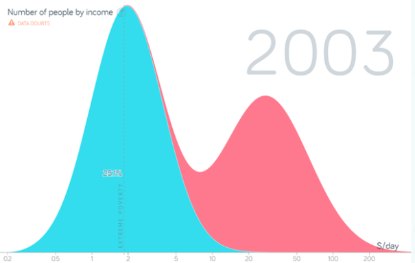
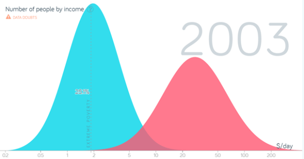
If these two neighbors merged across the Red Sea into one nation the result would look a bit like South Africa. Because the two economies would not be fully integrated, a binomial distribution would be the result as displayed in the graph below where the two distributions are stacked with the Saudi plopped on top of Sudan.

The merged country would have a single color and look like this:

Similarly, if you look at other social indicators for South Africa, like educational achievement, you get a similar bimodal distribution with two peaks.

Posted in Inequality, Medianism

Did we reach peak market circa year 2000?

For centuries, markets have been expanding into ever greater spheres of human life and displacing non-market human interaction. This has been an exciting time for economists because economists mostly just study markets.  This has led economists to neglect major spheres of human activity such as the economic interactions within households and families which is unfortunate because the family has always been a much more important institution for the creation and distribution of goods and services than markets due to the fact that the majority of Americans have always gotten more of their goods and services via households than markets.

Libertarian economists have particularly celebrated the relentless expansion of markets as you can see at the website, Markets In Everything or among anarcho-capitalists like David Friedman who hopes that markets will eventually expand to completely replace government.  Recently there have been signs that the forward march of markets may have reversed and markets are now a shrinking share of total economic activity. For example, the FRED graph below shows that the percent of Americans who worked in markets peaked in the year 2000 at a bit under 50%.

We don’t have a measure of non-market economic activity, so we cannot know when the market share of total economic activity peaks, but this graph probably gives the single best measure of how much of Americans’ lives are dominated by markets because labor income is the majority of GDP, Americans households get over 80% of their income from working, and market work is the single biggest time commitment for most adults after sleep. The blue line represents the percent of Americans with any amount of market work and the red line is just the full-time workers. It shows that only about 30-something percent of the American population has ever been working full time. Presumably, most part-time workers rely on sharing resources with family, so the blue line somewhat overstates the importance of markets.

Since 2000, the relative importance of markets has been shrinking as fewer Americans have been working for pay. This trend is compounded by the fact that each worker has been working fewer hours per week for decades as you can see below. The graph shows two different data series that are not perfectly in sync due to measurement error, but both show the same basic story of declining work hours and the same thing is happening in all rich countries around the world. As individuals get wealthier, they tend to spend less time working.


Although the employment-population ration in first graph has been trending back upward again since the last recession, this is probably just a temporary rise that is due to the economic recovery and the next recession will push it back down again. The US labor market is unlikely to ever return to the peak employment level reached in 2000 because the American workforce is getting older and more of the population will drop out of the labor force as more Americans retire. In 2015, 22% of the population was age 65 or older and the number of senior citizens is climbing rapidly.

Plus, the percent of American males who are working (blue line) has been steadily dropping since the 1940s mainly because an increasing percentage of men have been getting their livelihoods from nonmarket sources, most notably from rising market work among women in their households. That had been offset by rising female labor-force participation (red line) until it peaked sometime around the turn of the millennium.

Historically, more Americans have always relied on family for their goods and services than upon market exchange. Our children, students, homemakers, disabled, and/or elderly parents have relied upon gift exchange for their economic wellbeing without market prices attached to the goods and services that they get. That is why the most important economic institution for most Americans has always been the family. But whereas most retired Americans used to live with their families and traditionally got most of their economic resources from their children, retirees are increasingly relying upon government programs for the elderly, notably Social Security, Medicare, and Medicaid. These government transfer programs have been a steadily rising percent of American market income as the following graph shows. They accounted for over 11% of GDP in 2015 and rising.

Around the world over the past century, governments have slowly been supplanting markets and increasing the share of GDP that they dominate. The main exception is the formerly communist nations which discovered that it was a bad idea for government to control 100% of GDP. New technology is one reason for the rising dominance of government. Social Security, Medicare, and Medicaid would be unthinkably unwieldy without computers and modern communication technology. Information technology has also enabled the rise of mammoth multinational corporations which have come to dominate an increasing share of the global economy. Although corporations interact with suppliers and customers via markets, within corporations, goods and services are produced and distributed according to the dictates of central planners (MBAs) who have proven to be more efficient than markets. There is little difference between how Lockheed Martin manages its 126,000 employees and how Communist Russia’s Uralvagonzavod operates. Although Lockheed Martin is one of America’s biggest private corporations and Uralvagonzavod was founded by communists and continues to be state-run, both get most of their money from government and almost exclusively sell to governments. Communist companies and private corporations operate internally in much the same way. Although corporations and families interact with outsiders via markets, internally they operate more like communism than markets. The expansion of corporations is also a sign that markets are becoming less important. This graph shows World Bank data for the declining share of self-employed Americans.

Small companies are so buffeted by markets that Americans increasingly prefer to work for central planners (MBAs) in big companies.  This has been a long-term trend around the world.  As nations get richer, their companies tend to get larger and a larger percentage of their workforce becomes employees with steady wages rather than entrepreneurs whose incomes rise and fall with the whims of markets.  Usually in poor countries the majority of workers are self-employed entrepreneurs.  As nations get richer, fewer people are self-employed and the biggest 2% of America’s firms employ 64% of American workers.  Startups are becoming rarer.

startups

Image credit: Inc

Technological developments contributed to the rise of markets and newer developments are now contributing to their decline. As computers develop smarter artificial intelligence, they will take over more and more jobs thereby either eliminating markets by bringing the price down to zero or by concentrating most of the profits in the hands of a few computer owners. The latter scenario is one where many jobs are being outsourced to computers that benefit a few tech-company owners thereby increasing inequality. Rising inequality will increase the government’s share of the economy because as inequality rises, transfer programs become ever more tempting for democracies because elite wealth becomes more lucrative to tax and the median voter feels more deprived relative to the elites and less sympathetic to letting them live in ever greater luxury. One of the reasons for the rise in government transfer programs like Social Security and Medicare since the 1970s has been the rise in inequality during this time. I expect that technology will continue to increase inequality and that will continue to increase democratic incentives to expand government transfer programs.

But even if there were no increase in government transfer programs, inequality could still destroy markets eventually by eliminating customers. For example, a large rise in inequality would eliminate most of the automobile, housing, and health markets because fewer people could afford these goods and rich elites cannot increase their consumption enough to replace the middle class. Rich elites can only buy a limited quantity of cars, houses, and doctor visits before they get completely satiated. The idea of consumption satiation is so far from most people’s reality that it is hard to imagine and some people think that it is impossible.

Technology is also directly destroying markets. For example, more and more of our information and entertainment is being created by volunteers because technology has made it virtually free for people to collaborate and distribute their creations. Wikipedia wiped out global encyclopedia markets. Open source software has wiped out big swaths of software markets, Craigslist and bloggers have destroyed a large segment of traditional journalism, and music corporations can no longer charge as much for recorded music. Many economists complain that GDP fails to measure the real growth of production in in the digital age because markets are being destroyed as the prices of many information goods are falling to zero and more digital production is moving back to the unpaid household sector. GDP fails to measure the fact that consumers are getting more benefit than ever before from greater access to information, music, and video because they aren’t paying for as much of it anymore. If artificial intelligence doesn’t destroy markets by increasing inequality, it will destroy markets by lowering the price of many services so close to zero that they will be given away for free. That is the optimistic scenario in which the median prosperity increases and paid work hours continue to decline. As we reduce our paid work hours, we will spend more time in the gift economy creating digital information and art to donate to the global community and more time creating traditional goods and services like labor-intensive artisanal wooden furniture and epicurean meals to donate to family members and friends.

We will always have markets, but peak market has passed and the economy of the future will be increasingly dominated by gift exchange, corporate management, and government exchange. Get used to it.

Posted in Development, Globalization & International, Managerial Micro

Economic Innovation Group & medianism

I commend the Economic Innovation Group for using median income rather than mean income to create their Index of Distressed Communities. They created a beautiful map of their Distressed Community Index where the old slave states and rural areas of the sun belt look particularly distressed. I’m not sure how much they weigh median income relative to the other components of their index (education, unemployment, poverty, and business growth), but at least they didn’t use mean income like most people do.

One bad decision EIG made in constructing their index is to compare the median income in each colored region to the state median income. This reduces the comparability of one state to another. For example, the border between North Carolina and Virginia shows greater economic distress on the Virginia side of the border, but this is probably an artifact of EIG’s bad methodology. The median income in rural counties in Virginia are compared with the high median state income ($64,900) whereas the adjacent rural counties across the border in North Carolina are compared with the low median income for that state ($46,600). As GEOFRED shows, the old slave states would look even redder in AIG’s index if the median income in each region were compared with the median income for the US as a whole:

Another way EIG could improve their index is by creating a second map to also display each region with an area proportional to its population. All of the big splotches of area on the map have very little population and because we care about people more than land, it makes more sense to weigh each area of land by the population. They could either preserve the basic outlines of each state by squeezing each region into the state as in this map

100716_1516_Mapsdisplay1.png

…or they could adjust the size of each region by its population which would make it look more like this map.

100716_1516_Mapsdisplay6.png

This is truly the most realistic way to represent the distribution of economic distress in the US.  The only reason we don’t use it is the lack of imagination by people like the EIG and the momentum of tradition.  Both problems will go away once people get used to seeing this kind of cartogram.  It is a much more realistic way to map the US population.

Posted in Medianism, MELI & Econ Stats

The median voter’s income is well above the median income

Dylan Matthews compiled a lot of data about the 2014 election including this graph of voter income:

Unfortunately, he didn’t divide up the graph according to median income.  That would give a more meaningful comparison because we could see what share of voters is richer than the median and what share is poorer and we could tell if the median voter is getting richer or not.  But this graph is pretty close to that because median household income averaged close to $50,000 during these elections, so it does give a pretty good idea how much richer the median voter is than the median American. For example, in 2010, the median household income was $49,276, and over 64% of voters earned more than that.

Poorer people don’t vote as often as richer people.  This is one reason government policy is skewed away from Americans below the average income. The other reason is that national politicians have spent most of their adult lives in households that earn far above the median income and they predominately hang out with people in the upper third of the income distribution. That is one reason they seem so out of touch with most Americans.  They don’t have much connection with Americans below the median income.

Posted in Medianism, Public Finance

A mmutilitarianist world map

If you make the area of each nation proportional to its share of world GDP, this is what you get:

This is a pretty realistic picture of how markets view the world. Markets are mmutilitarian and care about maximizing the sum of market dollars. They care less about the entire continent of Africa than they care about single states in the USA. This is why markets devote many times more resources to developing medicines for the pets of people in the fat countries than for the tropical infectious diseases that kill the most people.

Here is another example from cost estimating website HowMuch.net that squishes GDP areas into geometric shapes that make it easier to compare sizes.

Look how much things changed since 1980:

Usually we care more about people than about dollars or areas of land and this map shows where most people live:

The map is created by covering the world in a grid and then adjusting the size of each area to represent the population.  In areas where the population density is low, the grid-lines get all compressed together into thick black lines that represent a lot of land without many people. The color spectrum represents altitude. Notice how much of the population of the tropics lives at very high elevations, particularly in Mexico, West Africa, South America, and Central America. Much of the rest is on islands in the Caribbean and in Southeast Asia. This is because elevation and sea breezes help cool the climate in tropical areas. Most of the rest of the tropical population is in India and China which is due to the productivity of rice cultivation in lowland regions.  Population growth in lowland West Africa developed in recent centuries and I believe that it too may be due to the development of rice cultivation.

Posted in Medianism, MELI & Econ Stats

Enter your email address to follow this blog and receive notifications of new posts by email.

Join 75 other subscribers
Blog Archive
Pages