Peak globalization?

Updated 2/19/23

The first wave of globalization happened due to technological advances in transportation and communication that dramatically reduced transactions costs in the 1800s:  Railroads, steel-hulled ships, the screw propeller, telegraph, etc.  Then politicians raised tariffs, restricted immigration, and went to war which caused trade and communication to collapse in the early 1900s.  The second wave of globalization happened mainly because of lower political barriers (like tariffs), lower communications (fiber optic cables and satellites), and lower transportation costs (due to better aviation and especially the shipping container).

The first big advance in containerized shipping was the invention of the pallet.  Skids that resemble pallets date back to Ancient Egypt, but they were little more than sleds and the real advance came first with the use of cranes for loading palletize goods onto ships and especially the development of the forklift starting in the 1800s for moving and stacking pallets inside of warehouses.

“According to an article in a 1931 railway trade magazine, three days were required to unload a boxcar containing 13,000 cases of unpalletized canned goods. When the same amount of goods was loaded into the boxcar on pallets or skids, the identical task took only four hours.”

Containerized shipping was the next big advance and it probably gave a bigger boost to globalization since 1950 than any other technology as detailed by the first history of “The Box” by Marc Levinson.

thebox

Consider in how a typical cargo ship would operate before the shipping container.  Tim Harford told about a typical 1954 cargo ship, the SS Warrior, that sailed from New York to Germany carrying 5,000 tons of food, vehicles, letters, and other cargo.  In total there were 194,582 separate items which required an incredible challenge to track as they were moved around the dock warehouses, loaded onto the Warrior and then the entire laborious process was reversed in Germany.  The warehouse workers would pile those 194,582 items onto pallets which were jumbled in the warehouse alongside numerous other pallets that were destined to other ships.  The ship took as much time to load and unload as it took to sail across the Atlantic Ocean.  Plus, there were even bigger delays in the ports to move the goods into warehouses and then sort out which goods should go onto what trucks and then onto trains and back again, so this laborious process repeated over and over resulting in much longer time loading, unloading, and sorting than the amount of time actually spent transporting.

Although the pallets made it easier to move the goods, they were vulnerable to spoilage from theft, rats, and during the slow loading and unloading process, the goods could be spoiled by rain while exposed on the docks and the decks of ships.  Inside the ships, each pallet was a slightly different size and the longshoremen often could not stack them and had to carefully wedge them together between the curved hulls of the ship using hooks and pry bars to try to prevent them all from shifting and spilling over on a rough voyage across the high seas.

The dangers of pallets falling over was severe even in port and this was a severe risk for longshoremen which was a far more dangerous job than manufacturing or construction.  Harford says that longshoremen were killed every few weeks in large ports.  In 1950, the New York port averaged about 6 serious incidents every day and it was a relatively safe place to work.

The Economist magazine explains containerization:

[C]ontainers—uniform boxes that can be easily moved between lorry, train and ship—have reshaped global trade over the past few decades. Why…?

Uniform metal containers were invented by Malcom McLean …in 1956. Before then goods were shipped as they had been for centuries. Crammed in to the hold of a ship, loose cargo in wooden crates would be loaded and unloaded by vast crews of dockworkers. The process was unwieldy, unreliable and so slow that ships often spent longer docked than they did at sea. Theft of transported goods was rampant: as an old joke put it, dock workers used to earn “$20 a day and all the Scotch you could carry home.”

Containers changed this in several ways. The price of everything fell…

  • The cost of loading and unloading fell …to $0.16 per tonne to load compared with $5.83 per tonne for loose cargo. …
  • Because containers were packed and sealed at the factory, losses to theft plummeted, which in turn drastically reduced insurance costs.
  • More could also be loaded: in 1965 dock labour could move only 1.7 tonnes per hour onto a cargo ship; five years later they could load 30 tonnes in an hour.
  • As a consequence, ships could get bigger and more efficient while still spending less time in port.
  • As containers made inland distribution by train and lorry easier, ports became bigger and fewer in number. (In 1965 there were 11 loading ports in Europe; by 1970 there were three.) This, along with increased productivity, meant fewer dockworkers were needed.

Furthermore, the Box eliminated the need for warehouses at every port and trainyard.  The box itself is a mobile warehouse which is rainproof, ratproof and relatively theftproof.

The Economist article also claimed that the Box undermined the bargaining power of longshoremen unions which is completely false.  The longshoremen unions have achieved incredible wages due to containerization. Harold Meyerson says that they are “this country’s best-paid blue-collar workers; many make more than $100,000 a year.” Although there are only a tenth as many people working the docks as in 1950, their wages are incredible because they are so much more productive and an upset longshoreman can sabotage an incredibly expensive process if he is not happy.  That gives enormous bargaining power.

Because containers ships are can be loaded and unloaded about 97% faster, and make it easy to stack much higher, they have enabled ships to grow in size so that modern container ships are over 20 times larger than the typical ship of the 1950s, and larger ships are more fuel efficient and labor efficient.  The biggest container ships are now as big as the Empire State Building and they are so big that they would require a train that is 90 miles long to carry all 24,000 of their 20ft containers.

New research also claims that containerization is the most important reason that trade has increased over the past half century.

[The authors] find that containerisation is associated with a 320% increase in bilateral trade over the first five years and 790% over 20 years. A bilateral free-trade agreement, by contrast, boosts trade by 45% over 20 years, and membership of GATT raises it by 285%. In other words, containers have boosted globalisation more than all trade agreements in the past 50 years put together. Not bad for a simple box.

But the effect of containerization was not mainly by reducing the cost of shipping.  The improved speed and reliability was just as important in boosting trade by allowing companies to reinvent their supply chains.

Speed and reliability of shipping enabled just-in-time production, which in turn allowed firms to grow leaner and more responsive to markets as even distant suppliers could now provide wares quickly and on schedule. International supply chains also grew more intricate and inclusive. This helped accelerate industrialization in emerging economies such as China, according to Richard Baldwin, an economist at the Graduate Institute of Geneva. Trade links enabled developing economies simply to join existing supply chains rather than build an entire industry from the ground up. But for those connections, the Chinese miracle might have been much less miraculous.

Although globalization seems like it might continue growing forever, it seems to have run out of steam. Here is a measure of globalization according to the latest World Bank data.  It is the ratio of exports of goods and services as a percent of world GDP.

world gdp-export ratio

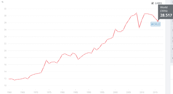
This shows that the world is less globalized in the latest data than it was back in 2005!  Is rising globalization over? Paul Krugman thinks so:

To explain a rising long-term ratio of trade to GDP, we have to turn instead to structural changes in the world economy, of which the most obvious involve declining costs of trade. My view is that rapid trade growth since World War II was driven by two great waves of trade liberalization and one major technological innovation. The first wave of trade liberalization involved industrial countries, and was largely over by 1980:

The second wave involved the great opening of developing countries:

This is still going on, but the major opening of Latin America, China, and India is already well behind us. …The point is that it’s entirely reasonable to believe that the big factors driving globalization were one-time changes that are receding in the rear-view mirror, so that we should expect the share of trade in GDP to plateau — and that this doesn’t represent any kind of problem. In fact, it’s conceivable that things like rising fuel costs and automation (which makes labor costs less central) will lead to some “reshoring” of manufacturing to advanced countries, and a corresponding decline in the trade share. Ever-growing trade relative to GDP isn’t a natural law, it’s just something that happened to result from the policies and technologies of the past few generations. We should be neither amazed nor disturbed if it stops happening.

The main technological improvements in shipping and telecommunications have long since run into diminishing marginal returns. International telecommunication is already so cheap that it can’t get much cheaper and the biggest innovation of the past half century in transportation was containerization (i.e. the “box”) which is already over half-century old and there haven’t been much additional gains.

Jessie Romero of the Richmond Fed says that as developing nations catch up technologically and as their wages rise, this could also depress trade:

there are signs of longer-term changes in the Chinese economy. “Two dimensions of the Chinese economy have changed,” says the University of Houston’s Kei-Mu Yi. “First, as they’ve become more technologically proficient, they can make a lot of the intermediate inputs themselves, and to the extent they do, their demand for imports would fall. Second, as their economy has gotten bigger, they are selling more domestically rather than exporting.” Just as China’s entry into the global market boosted trade for the world as a whole, a persistent decrease in China’s trade could depress global trade growth…

In addition, rising labor costs in developing countries could alter the calculation; hourly manufacturing wages in China, for example, have increased on average 12 percent per year since 2001. Natural disasters such as the Fukushima earthquake also could make managers nervous about having long supply chains. Anecdotally, a number of American companies have been “reshoring” manufacturing to the United States. The Reshoring Initiative, an advocacy group, estimates that about 248,000 jobs that left the United States have returned since 2010…

In addition, rising labor costs in developing countries could alter the calculation; hourly manufacturing wages in China, for example, have increased on average 12 percent per year since 2001. Natural disasters such as the Fukushima earthquake also could make managers nervous about having long supply chains. Anecdotally, a number of American companies have been “reshoring” manufacturing to the United States. The Reshoring Initiative, an advocacy group, estimates that about 248,000 jobs that left the United States have returned since 2010.In addition, rising labor costs in developing countries could alter the calculation; hourly manufacturing wages in China, for example, have increased on average 12 percent per year since 2001. Natural disasters such as the Fukushima earthquake also could make managers nervous about having long supply chains. Anecdotally, a number of American companies have been “reshoring” manufacturing to the United States. The Reshoring Initiative, an advocacy group, estimates that about 248,000 jobs that left the United States have returned since 2010…

Constantinescu and her co-authors pinpointed 2000 as the beginning of the decline in the trade elasticity, other research has found that the decline did not occur until the Great Trade Collapse [of 2008].

It is true that trade has collapsed more in places like China and India than in the US.  Here is the same data as in the first graph above, but with India, China, and the US added which shows that whereas trade in the US has changed at about the same rate as the rest of the world, trade in India and China has collapsed from where it was a few years ago.

At about the same time as international trade has started falling, immigration also fallen. Immigration to the US peaked over a decade ago in 2007. Here is Pew’s data for the total number of unauthorized immigrants in the US.

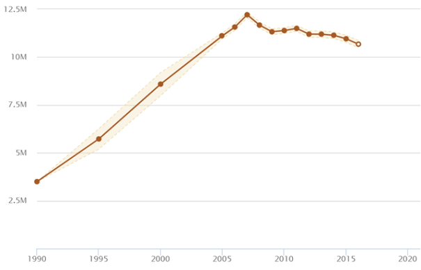
Immigration has been declining for a decade too.

Posted in Globalization & International

A history of the Corporation

There have always been large organizations that have done the kinds of things corporations do, but for most of human history, large organizations were run by religious hierarchies or governments rather than for-profit businesses. For-profit businesses were always small which is nowadays defined as less than 500 employees, and businesses were much smaller than that and they were usually run by families until the rise of the corporation and other large businesses (trusts and partnerships) that were part of the advent of capitalism.  One reason businesses were small was that there weren’t any private-sector business activities that required huge scale.  Only governments and churches undertook activities that required more than about a hundred workers.  Some “private” businesses did grow bigger than 100 workers, but they were primarily government contractors that were engaged in public works such as the publicani of the Roman Republic. 

The publicani said to be the earliest precursor of the corporation because they were large organizations with diffuse ownership, but there are some crucial differences such as the fact that membership in the publicani was more like club membership and shares were not bought and sold on a free market. Plus, the publicani solely served the government rather than profiting from entrepreneurial activities.  They were purely agents of the state unlike most modern corporations whose business models are directed by market incentives. 

William N. Goetzmann and K. Geert Rouwenhorst argue that there are three distinguishing features of a modern corporation but publicani only have the first two:

First, [a corporation’s] existence is not affected by the departure of individual members. This stability enhances its ability to participate in economic transactions.

This isn’t really unique to corporations. Most big organizations share this feature: Churches, cities, and governments, and modern society increasingly categorizes all big organizations as corporations, but this essay is defining a corporation as a for-profit business as opposed to non-profit and governmental corporations. 

As corporations get more complex, they require more separation of ownership from control.   But it is a remarkable fact that only a very small percent of private businesses in all of history have been able to survive the death or departure of an owner partly because most businesses have always been sole proprietorships (72% of US businesses today) or partnerships (10% of US businesses today) which are designed to be embodied in the owner unlike corporations.  The word corporation literally means “body” partly because a corporation is a separate legal person from those who work in it which is the second characteristic:

Second, designated members of the company can represent it, in other words, they can enter contracts without assuming rights or duties themselves. Instead, the company becomes the bearer of all obligations.

This is the idea of a corporation having legal personhood so that it can make contracts and bear responsibility for problems rather than transferring liabilities on workers or owners. Legally, only a person can be sued which has never been a problem for a businesses that is either a sole proprietorship or partnership, but it is more complicated for corporations.  Limited liability for corporate owners is a surprisingly modern phenomenon (see below), but large organizations inherently diffuse responsibility and hence liability.  Publicani members technically had legal liability for the organization under Roman law, but there was a huge loophole. A publicani’s owners could entrust a slave to manage the publicani and then the owners could argue that they should not be held responsible for what the slave did, and then the slave could bear all the liability. Furthermore, another longstanding method for shielding corporate investors from liability is by structuring shares as debts rather than shares of ownership because debts always have limited liability.  Lenders can only lose as much as their past contributions, just like modern corporate shareholders. 

Corporations necessarily need to empower their CEO or managers to take on liabilities (and all contracts involve some sort of liability), but the practice of completely insulating shareholders from all liability was illegal until the middle of the 19th century.

After shareholders were freed from the last vestiges of legal responsibility for owning firms that committed crimes, and this caused investors to feel free to diversify ownership across a multitude of companies without fear of losing more than their initial investment. This freedom magnified the separation of ownership from control:

Imagine a person who owns a horse: “If the horse lives, he must feed it. If the horse dies, he must bury it. No such responsibility attaches to a share of stock. The owner is practically powerless through his own efforts to affect the underlying property.” This is what happened at US Steel. At its founding in 1901, it was but the lengthened shadow of two men, Andrew Carnegie and J.P. Morgan. By 1932, its shareholders numbered almost 175,000, with each individual “owner” controlling nothing. Many companies in the United States followed this pattern …and …became bigger and more complex. Seeking outside investment, they took on thousands of stockholders, and ownership and management began to go their separate ways.

The other unique feature of modern corporations that was required to allow owners to diversify was the advent of stock markets where shares were easily bought and sold just like the debt markets which had already existed for centuries. The first stock exchange was in Amsterdam where the shares of the first modern corporation were traded. The first corporation in the modern sense of the word was the Dutch East India Corporation (VOC) because it was the first publicly traded corporation with all the core features of modern corporations.  This leads to the third feature of a corporation:

Third, …ownership is fungible and shareholders can react to changes in a firm’s prospects …by buying or selling shares. The separation of ownership and management makes it easier to attract human and financial capital.

This is a huge difference between modern corporations and the Roman publicani. The kind of publicani shares that gave ownership control were more like a kind of club membership and were not bought and sold on secondary markets.  Although some modern authors claim that shares were sometimes bought and sold, there is no primary evidence. For example, there was no stock exchange of any sort in the Roman world and it isn’t even clear if the ‘shares’ of the publicani were ownership stakes or if they were just variable-interest-rate loans. The latter is more likely because loans were a common feature of business across the ancient world and the first tradeable governement bonds were issued by Genoa in 1214 and the practice spread across northern Italy despite the Catholic Church’s ban on charging interest.  . 

Nick Szabo says the Italian city-states of northern Italy redeveloped something like the publicani during the renaissance and again their main purpose was tax farming:

The medieval organizations that most resembled later joint-stock corporations were the Genovese maone. … The Italian cities often sold off their tax receivables to wealthy merchants at a discount as a way to borrow funds. …The debts were divided into equal shares called loca or partes. Legally, these shares were personal property (chattels) and could be freely traded.

Technically, no organization was created when the city sold its tax receivables to merchants. However, to effectively collect the taxes, the holders of loca formed an organization called a maona or societas comperarum. This organization would then subcontract to tax farmers to collect the taxes. By the fourteenth century, Genovese maone also engaged in military conquest and colonization… Normally, maone were temporary, but some of them ended up lasting for a long time. In 1346 the Maona di Chio e di Focea … was formed. This organization’s members obtained from Genoa the exclusive right to collect taxes from Chios (an Aegean island) and Phocaea (a port on the Anatolian coast). But first the company would have to conquer them! Although technically a temporary organization, it lasted until 1566.

Rather than going to buy receivables from Genoa, subscriptions to the di Chio e di Focea’s loca shares (still legally debt, but to be paid out in dividends as taxes and trading revenues were collected) went to fund 29 galleys to conquer Chios and Phocaea. The Genovese Republic, for a fee, granted the organization exclusive rights to collect taxes from the conquered territories as well as special trading privileges. The conquests, taxes, and trading were at least partially successful, and by the 16th century more than 600 persons owned loca of the maona.

A huge difference between how the publicani and maone operated modern corporations is the fact that the publicani were not businesses that served the private sector at all. They were solely government leaseholders or contractors. They were most famous for managing tax collection and in many ways they functioned more like a form of government bureaucracy than today’s private corporations. It was a competitive form of bureaucracy, but it served as an arm of government, not a creature of markets.  After the Roman Republic turned into the Roman Empire, the government phased out publicani contracts and “without the support of the government, the societas publicanorum drifted into obscurity.”

Although the publicani disappeared, Romans had other forms of corporations that were non-profit and served religious and public functions which survived the fall of the Roman Empire such as cities, hospitals, guilds, monastic orders, and the Catholic Church itself.

Glyn Holton argues that modern corporations evolved out of medieval guilds:

This changed around 1600, when new business forms emerged to challenge the might of Spain and Portugal… Portugal had discovered the East Indies as the source of spices, and Spain was plundering the Americas for gold and silver. The Vatican legitimized this arrangement, ruling that lands discovered in the Eastern Hemisphere belonged to Portugal while lands discovered in the Western Hemisphere belonged to Spain. Holland and England flaunted the Vatican’s law. Not only did they practice a different religion, but they adopted different methods. While the Spanish and Portuguese sovereigns shouldered the expenses and risks of overseas ventures, English and Dutch traders formed private corporations to challenge them.

These trading corporations had their roots in guilds. During the 14th and 15th centuries, guilds were chartered primarily to enforce a monopoly in certain businesses or geographic regions. In exchange for a grant of monopoly, a guild would make ongoing fee payments to its chartering [government]. Members of a guild might compete with one another, but outsiders were excluded.

Traders also formed guilds. Their purpose was to secure from the government a grant of monopoly over trade with specific geographic regions. In England, such guilds were called regulated companies. They were often referred to by names reflecting their monopolies—the India Company, African Company, Russia Company, Turkey Company, etc.

…Regulated companies that sponsored equity-financed voyages came to be called joint-stock companies. Two early joint stock companies were Holland’s and England’s respective East India Companies, which were chartered to challenge Portugal’s dominance of the spice islands. Initially, neither company had permanent equity. Each voyage would have its own equity subscription. This proved impractical, and soon capital from one voyage was being rolled over to finance subsequent voyages. In this way, the companies evolved to become much like today’s business corporations. They had separate managers and investors.

A modern corporation could not arise until the VOC in the 1600s for the same reason that other forms of mass democracy could not arise until mass media technologies were invented.

The innovation that allowed corporations to dramatically expand ownership was the printing press.  A corporation is a form of mass democracy and just as democratic participation in government is limited in scope by communication technologies, so is democratic participation in investing and managing a private company.  Early corporations first arose in the most democratic states of their day perhaps because the social technology of democracy was already in use the public sphere and was easier to copy to private business or vice versa. 

A corporation requires cheap communication technologies to convince a wide array of investors that their money will not be squandered and in turn to give shareholders a say in how the company is run by giving them the power to elect representatives to the corporation’s board of directors.  Once printing became cheap enough to spread this kind of information, corporations became a viable way of bringing together not just a relatively insular group of acquaintances, but investors who have mostly never met in their lives.

The main difficulty of a corporation is achieving the shareholders’ trust in the management and that requires regular communication.  Mass communication allows trust to spread much more widely, but trust also requires accountability and that requires accounting. 

Luca de Pacioli published the first book on accounting in 1494.  His book disseminated a double-entry bookkeeping standard that across the world whose fundamentals are basically unchanged after more than 500 years.  Without that kind of accounting standard, modern corporations and capitalism would have been impossible. 

Although today it seems inevitable that corporations would eventually rule the world, corporations were often unpopular because of numerous corporate scandals and government bailouts. Although we remember the few big successes like the East India Company and the Hudson Bay Company, most corporations were usually unpopular partly because most of them were corrupt and/or went bankrupt despite various advantages such as a government-enforced monopoly. For example, Adam Smith (1776) denounced corporations in The Wealth of Nations because he thought corporate governance was so inherently flawed, it could never achieve anything beyond what you might see in a Dilbert cartoon.

…The directors of [joint stock companies] being the managers rather of other people’s money than of their own, it cannot well be expected, that they should watch over it with the same anxious vigilance with which the partners of a private copartnery frequently watch over their own … Negligence and profusion, therefore, must always prevail, more or less, in the management of the affairs of such a company. It is upon this account, that joint stock companies for foreign trade have seldom been able to maintain the competition against private adventurers. They have, accordingly, very seldom succeeded without a [monopoly]…

Adam Smith then goes on and on with examples of the foibles and crimes of his contemporary corporations that make episodes of The Office look like a well-run bureaucracy. In 1720, The British Parliament passed the Bubble Act which restricted the formation of corporations for over a century without permission from Parliament or a Royal Charter. But after the industrial revolution began transforming Britain, the government started making it easier to form corporations again. Glyn Holton again:

Incorporation by Registration

A recurring theme in the history of corporations is that they should exist to serve some public purpose, and they are granted certain privileges to facilitate this. The state would charter corporations that it deemed worthy. At first, the most important privilege was a grant of some monopoly—say a monopoly over trade with some region or an exclusive right to build a certain canal. Over time, transferability of shares and limited liability became more important. These gave corporations an enormous advantage in raising capital over sole proprietorships and partnerships. Investors with modest holdings and limited liability were comfortable letting specialists run their corporations, so the separation of investors and management became one of the great strengths—and great weaknesses—of limited liability joint-stock corporations.

The building of highways, canals and railroads was a quintessential public need, and numerous corporations were chartered for these purposes. For other businesses, the state’s monopoly on granting corporate status proved onerous. When entrepreneurs tried to form a new corporation, competitors could oppose their petition for incorporation. Inevitably, the process was marked by political intrigue. When incorporation was denied, entrepreneurs had meager options. They might buy a failing corporation as a shell and then raise capital for a business unrelated to that corporation’s original monopoly. This practice was called charter abuse. With the supply of failing corporations limited, a more common solution was to simply issue stock in unincorporated companies. This legally perilous practice became widespread in England during the late 1700s… In the early 1800s, competitors started challenging their legality in court.

The …courts and governments found themselves making increasingly arbitrary decisions about which businesses to favor. Something had to be done. The solution was a new concept: incorporation by registration. In various countries, legislation was passed [in 1844] allowing entrepreneurs to incorporate any firm they liked by simply filing paperwork. No longer would corporations be privileged associations granted monopolies by the state to pursue some public purpose. They had become a standard business form—along with sole proprietorships and partnerships—that was available to all.

This was a big difference between the corporations of the past which were supposed to advance some aims of the government versus the corporations of the present which are solely intended to serve their (disproportionately wealthy) owners.  Most corporations originally had a charter of limited duration,  generally 10 to 40 years, and had to be liquidated upon expiration if a new charter was not granted.  This was a reasonable expectation at the time when corporations were intended to serve a public purpose and if they failed to achieve that purpose within a reasonable time, they were expected to be held accountable for that failure.  

One of the primary problems of government before the 20th century was that it was difficult to tax economic activities and the fees corporations paid were one way to generate government revenues.  The original corporations were often given some monopoly power as a way to attract investors and then the corporation had to pay a share of the profits to the government.  Or in some cases, corporations were also used to advance other pubic policy goals such as beating foreign rivals in colonial power grabs or building canals because such ventures were too expensive and risky for the government to fund directly.

In all of the history of corporations until about 1856, shareholders were at least theoretically responsible if the company caused harm to the public although in practice, their actual risk of liability was very small. That officially changed in 1856 with the UK’s Limited Liability Act which limited liability for most corporations with more than 25 shareholders. In 1892, Germany copied the UK and expanded the scope of limited liability to include all corporations and even protected sole proprietors if they established a wholly-owned corporation.

In 1886, the US ruled that corporations are legal persons whose freedoms cannot be restricted under the 14th amendment. The 14th amendment had been written after the Civil War with the intention to protect the rights of emancipated slaves as persons, but ironically it was used to expand the personhood rights of corporations instead.  In the first 44 years after the 14th amendment was enacted, it was used to protect the rights of corporations in 312 cases and it was only used to decide about the rights of former slaves and their descendants in 28 cases.  

Kristen Alff argues that cultural acceptance of limited liability and corporate personhood took much longer than the legal rights and so even in Britain, the full acceptance of corporate personhood with limited liability did not happen until  World War I. 

With each legal innovation, business lobbying expanded the power of business by creating new species of corporations such as private equity companies which began in 1946, S-Corporations in 1958, special-purpose entity (SPE) a concept that was first coined in 1973, and Limited Liability Companies (LLCs) which Wyoming pioneered in 1977.  A LLC is not necessarily a corporation and most are sole-proprietorships or partnerships, but there are also some big private corporations like Crayola, Domino’s Pizza, and Ritz-Carlton have become LLCs.  The big advantage of an LLC is that it eliminates personal liability without requiring any corporate income taxes and there are fewer regulations on LLCs than on C-corporations or S-corporations. 

The success of businesses to lobby for more power can be seen in their recent success in achieving the right to spend unlimited money to lobby for more political power in the 2010 Citizen’s United case.  Before Citizen’s United, corporations had always been greatly restricted from using their might to influence elections and politicans and most financial  political process or at least  explicitly banned from .  Wealthy business people have always had lots of creative ways to get around those laws and use their money to buy influence, but it was legally constrained in well-run democracies.  Now that unlimited corporate money can flood into the American political process, the data shows a large increase in corporate political expenditures and that is just the money that we can track.  Citizen’s United also legalized unlimited dark money spending that intentionally  helps (often corporate) donors hide their identity to shield them from embarrassment.  

The original idea that corporations should serve some public interest was always part of the social fabric at least in theory.  Corporations often fell short of that ideal in practice, and that was one of the reasons why they were so unpopular going all the way back to Adam Smith and beyond.  But even the theory that they should serve the public good fell away in the 1970s and 80s with the rise of neoliberal ideology.  Notably, Milton Friedman published an essay in 1962 (republished in 1970 and several more times) in which he argued that, “The Social Responsibility of Business is to Increase its Profits.”  

That ideology was radical at first, but it began to spread in business schools and law schools and the idea that corporations should do nothing but extract profits for their elite owners has come to be the social norm which has even achieved some legal standing.  A CEO of an ordinary corporation can be sued by shareholders for doing anything that benefits society at a cost to profits.  It is rare, but it has happened beginning in at least 1919.  In response to this legal reality, the B Corporation was developed in 2010 in Maryland to give legal protection to management if they do something that benefits the public at the expense of shareholders.  

The powers, responsibilities, and structures of corporations have been changing for thousands of years up through recent changes for bad (such as Citizen’s United) and for good (such as the B Corporation).   Corporations are powerful and can be a force for good, but power is dangerous and as JK Galbraith claimed in his 1967 book, The New Industrial State, corporations have become so powerful that they have transcended competing sources of countervailing power such as democratic accountability.

Even though corporations are a growing fraction of the US economy, they comprised only 18% of US firms in 2010.  That may seem small, but they generated 82% of revenues which means that corporations are the core of the machinery of capitalism today.  This machinery is continually evolving as governments change the legal design of how corporations must be structured. 

The government is even more deeply involved in designing the structure of the corporations that are the most important part of capitalism: finance. 

The three biggest corporations of all time (by market capitalization) were colonial shipping companies: the Dutch East India Co., the Mississippi Co. and the South Sea Co.  After adjusting for inflation, they were more than double the size of today’s biggest company, Apple

Posted in Managerial Micro

The average Canadian became richer than the average American a decade ago.

Most people think that most Americans are richer than Canadians because that was true for most of history, but that ended a decade ago.  The Great Recession of 2008 hurt Americans more than Canadians and the median income in Canada has been higher than in America ever since 2009. The following graph shows the Global Consumption and Income Project‘s estimate of median income in both countries (using PPP):

The median American was a lot richer than the median Canadian in 1960–42% richer. By the end of this data set (2015), the median Canadian was almost 7% richer.

Most people still don’t realize this is true because most people use mean income as THE measure of economic well being. The story looks different when using mean income:

Mean income is still a bit higher in the US than in Canada due to rising inequality in the US.  America’s billionaires have been doing better than Canada’s and they pull up average income, but the average American hasn’t done so well.

Here is what happened to inequality in the US vs. Canada as measured by the ratio of mean income to median income.  The rising ratio in the US shows higher inequality whereas inequality is now lower in Canada than it was at the beginning of this data set.

inequality_canada_usa

Partly because of lower inequality in Canada, economic opportunity is higher there and Canadians are twice as likely to achieve the American Dream than Americans according to Fortune Magazine:

Stanford Economist Raj Chetty’s study, Improving Opportunities for Economic Mobility: New Evidence and Policy Lessons, published by the St. Louis Federal Reserve Bank, defines the “American Dream” as the statistical probability that a child born to parents in the bottom fifth on the income distribution scale ends up in the top fifth.

Children in the United States have a 7.5% chance of achieving that economic mobility, according to the study. By comparison, Canadian children have a 13.5% probability.

Chetty’s research shows that some areas have much higher economic opportunity (like San Jose California) than other areas (like most of the former slave states, and, sadly, my home state of Ohio).

American_dream_map.PNG

This map is also quite similar to the maps showing where Americans have low (and decreasing) life expectancy with a few exceptions such as many cities having lower than average economic opportunity even though they tend to have higher than average life expectancy nowadays.

Posted in Medianism

What are the cheapest countries to visit? See the Travel Cost Index.

There is a lot of interest on blogs and discussion forums about the cheapest nations in the world to visit, but I found no good hard data on the internet.  This is a bizarre hole in the world’s collective knowledge (at least as revealed by Google) because it is easy to predict what countries are the cheapest to travel in for Americans using readily available data and a bit of economic theory.  All you need are two things:  the market exchange rate and the prices in each nation.

In 2008, a Big Mac cost $3.57 in the US and £2.29 in the United Kingdom.  Does that mean that the UK is cheaper than the US?  No, because the market exchange rate was $2 = £1 and that makes the UK seem more expensive than the US because a tourist exchanging a thousand dollars would only get five hundred pounds.

In reality, you need both prices and the exchange rate to know if Britain is a cheap place to travel or an expensive place.

What is the Purchasing Power Parity (PPP) exchange rate and how is the Travel Cost Index calculated?

The best available measure of relative prices in different countries is called the purchasing power parity (PPP) exchange rate.  PPP is simply what you get when you divide the prices of goods in one currency by the prices of the exact same goods in another currency.  PPP is the price ratio that tells you how much higher prices are in one country than in another.  For example, suppose the only price we care about is the price of a hamburger.   If an identical hamburger costs $2 in the US and €4 in France, then a dollar is worth €4/$2 = 2€/$.  That means the purchasing power parity of a dollar is two euros.  PPP tells you how many dollars it takes to buy the same goods in euros and vice versa.

By itself, PPP tells us nothing about how expensive it is to visit Paris because it doesn’t tell how many euros you can actually exchange for one dollar.  That is the market exchange rate.  If the market exchange rate equals the PPP exchange rate, then the cost of traveling in France is exactly the same as the cost of travel in the US. For example, if the two exchange rates are equal, as in the above example, then 2€/$/2€/$=1 and both countries are equally expensive. When the two exchange rates differ, the percent difference tells you how much cheaper (or more expensive) another country will be.

That ratio is the Travel Cost Index (also known as the “real exchange rate“): the PPP exchange rate divided by the market exchange rate.  For example, if the market exchange rate value of the dollar is more than the PPP exchange rate value, then France will be less expensive than America.  For example, at the end of 2017, one dollar bought 1.20 euros, and the price ratio (PPP) between France and America was 1.08 (meaning prices were 8% higher in euros than in dollars).  If you divide the two you discover that (1.08€/$)/(1.2€/$)=0.9 or ninety percent.  This means that France was about 10% cheaper than the US according to the World Bank for 2017.  Of course, this is just an average and Paris is going to be more expensive than most parts of France, but the same is true of New York City compared with the rest of the USA.

The Economist Magazine has used price of Big Macs around the world to actually create what they call the Big Mac index since 1986.  This is often interpreted as a measure of PPP, but it is actually a kind of travel price index or at least it would give useful information about what countries are cheap to visit if you like to eat at McDonalds everywhere you go (like President Trump) and you don’t buy anything else!

bigmac

bigmac2

According to the Big Mac travel cost index, Switzerland costs 18% more than America whereas Qatar costs 40.9% less.  But that is just using one price, the price of a Big Mac, to adjust for cost of living in different countries.  The World Bank estimates PPP cost of living using an index of hundreds of prices which makes it much more representative of overall costs.  Even though the World Bank PPP is much better than the Big Mac PPP, the two data sets produce fairly similar rankings of the costs to travel in different countries.

This World Bank map gives an approximate value of how expensive each nation was in 2019:

travel cost index(Click here for an interactive version)

The table below gives the numerical data for 2017.  The cheapest country in the world in 2017 was Egypt which is right next-door one of the most expensive, Israel.  In Egypt, it only took 21 cents to buy a dollar’s worth of goods and services on average.  That is like the whole country being on sale, almost 80% off!  The very most expensive was Iceland where it took $1.32 to buy what normally costs only $1 in the US.  The index says that 49 cents in Mexico buys as much as a dollar in the US which means that Mexico was approximately half price compared to travel in the US.

(Note: The following table is very long, so you can click here to scroll to the end and continue reading.)

Country Name 2017 Travel Cost Index (World Bank Data) 2018 Travel Cost Index (October OECD Data)
Egypt, Arab Rep. 0.21
Uzbekistan 0.22
Azerbaijan 0.24
Tajikistan 0.25
Iran, Islamic Rep. 0.26
Algeria 0.27
India 0.27
Pakistan 0.28
Malawi 0.28
Gambia, The 0.28
Mongolia 0.29
Mauritania 0.29
Madagascar 0.29
Tunisia 0.29
Afghanistan 0.30
Iraq 0.30
Belarus 0.30
Ukraine 0.30
Congo, Rep. 0.31
Nepal 0.31
Indonesia 0.31
Timor-Leste 0.32
Sri Lanka 0.32
Tanzania 0.32
Uganda 0.32
Bhutan 0.33
Sierra Leone 0.33
Kyrgyz Republic 0.33
Mozambique 0.33
Kazakhstan 0.33
Nigeria 0.34
Malaysia 0.34
Chad 0.35
Vietnam 0.35
Cambodia 0.35
Lao PDR 0.35
Ghana 0.35
Macedonia, FYR 0.36
Philippines 0.36
Burkina Faso 0.36
Brunei Darussalam 0.36
Kosovo 0.36
Morocco 0.37
Benin 0.37
Rwanda 0.37
Thailand 0.37
Niger 0.37
Zambia 0.37
Mali 0.37
Oman 0.38
Guinea 0.38
Albania 0.38
Lesotho 0.38
Eswatini 0.38
Nicaragua 0.38
Senegal 0.38
Georgia 0.38
Saudi Arabia 0.39
Suriname 0.39
Serbia 0.39
Cameroon 0.39
Bangladesh 0.39
Togo 0.39
Bulgaria 0.40
Equatorial Guinea 0.40
Gabon 0.40
Turkey 0.40 0.37
Moldova 0.40
Bosnia and Herzegovina 0.40
Kuwait 0.40
Ethiopia 0.40
Libya 0.41
Armenia 0.41
Montenegro 0.41
Turkmenistan 0.41
Russian Federation 0.41
Burundi 0.42
Romania 0.42
Cote d’Ivoire 0.42
Haiti 0.42
Guinea-Bissau 0.43
Colombia 0.43
Botswana 0.44
Dominican Republic 0.44
Bolivia 0.45
Paraguay 0.45
Jordan 0.45
South Africa 0.46
Kenya 0.46
Cabo Verde 0.47
Mauritius 0.47
Poland 0.48 0.5
El Salvador 0.49
Mexico 0.49 0.57
Peru 0.49
Qatar 0.49
Honduras 0.50
Bahrain 0.50
Namibia 0.50
Hungary 0.51 0.54
Trinidad and Tobago 0.51
Comoros 0.51
Congo, Dem. Rep. 0.52
Zimbabwe 0.52
Lithuania 0.52 0.59
China 0.53
Croatia 0.53
Ecuador 0.53
Seychelles 0.54
Guatemala 0.55
United Arab Emirates 0.55
Liberia 0.55
Slovak Republic 0.56 0.62
Czech Republic 0.56 0.63
Latvia 0.57 0.67
Jamaica 0.57
Sao Tome and Principe 0.57
Belize 0.57
Central African Republic 0.58
Guyana 0.58
Lebanon 0.58
Fiji 0.58
Nauru 0.59
Sudan 0.59
Papua New Guinea 0.61
St. Vincent and the Grenadines 0.61
Singapore 0.61
Panama 0.62
Estonia 0.62 0.72
Chile 0.62 0.67
St. Kitts and Nevis 0.63
Maldives 0.63
West Bank and Gaza 0.63
Brazil 0.63
Antigua and Barbuda 0.64
Angola 0.65
Samoa 0.66
Tonga 0.66
Portugal 0.67 0.76
St. Lucia 0.67
Greece 0.67 0.76
Slovenia 0.68 0.76
Malta 0.68
Costa Rica 0.68
Argentina 0.69
Grenada 0.70
Macao SAR, China 0.70
Dominica 0.72
Uruguay 0.72
Cyprus 0.73
Spain 0.74 0.84
Hong Kong SAR, China 0.75
Kiribati 0.77
Korea, Rep. 0.78
San Marino 0.80
Italy 0.81 0.91
Germany 0.88 0.95
Micronesia, Fed. Sts. 0.88
Solomon Islands 0.88
Japan 0.89 0.92
Marshall Islands 0.90
France 0.90 0.98
Barbados 0.90
Austria 0.90 0.98
Tuvalu 0.90
Belgium 0.91 1.01
Ireland 0.92 1.1
United Kingdom 0.92 1.05
Netherlands 0.92 1.01
Palau 0.92
Canada 0.96 1.03
Vanuatu 0.97
United States 1.00 1
Luxembourg 1.00 1.15
Bahamas, The 1.01
Finland 1.02 1.09
New Zealand 1.04 1.06
Israel 1.05 1.17
Sweden 1.06 1.05
Denmark 1.10 1.26
Australia 1.11 1.13
Norway 1.23 1.27
Switzerland 1.24 1.38
Iceland 1.32 1.38

What are flaws in the Travel Cost Index?

The Travel Cost Index is only an approximate estimate of relative price levels because, first of all, PPP doesn’t just focus on the kinds of things that tourists buy. It measures a much broader ‘basket’ that tries to encompass all goods and services, some of which, like “200 types of equipment goods and about 15 construction projects” are completely irrelevant to tourists whereas a lot of the things that are important to tourists like tour packages are probably not measured in the PPP index at all.  The PPP index only includes 3,000 consumer goods and services, so it leaves out a lot of things, and the kinds of things travellers buy are poorly represented.

Some countries are going to be cheaper than the Travel Cost Index indicates because some places like Thailand have an extremely efficient tourism infrastructure which brings down prices for tourism-related purchases relative to everything else and other countries like Iraq (probably) have not developed travel infrastructure that is as efficient for handling international visitors from around the world.

Another problem is that some regions in every country have cheaper prices for travelers than other regions and if you are in an expensive region, like New York City in the US, you’ll need a very different budget than you would need in a cheap region, like West Virginia. The PPP index tries to show average prices, and that means that the prices in rural areas is going to typically be lower than the PPP index (at least for the kind of purchases that rural people routinely buy), and costs in large cities are typically going to be higher.  Some international firms like UBS have created proprietary cost of living indexes for the biggest cities in the world, but it is hard to get up-to-date data from them.

To estimate true costs, a traveller should add about 3% because  foreign exchange transactions costs usually average about 3% which just makes international travel more expensive than domestic travel. No traveler can get the published market exchange rate due to those transactions costs and so every country is really going to be about 3% more expensive on average than the Travel Cost Index shows.

Finally, the Travel Cost Index uses World Bank Data which is generally about a year out of date.  This is one reason it doesn’t agree with the newer OECD data, (and I’m not sure what accounts for the rest of the discrepancy).  PPP is obviously not an exact science as explained above.  In any case, the travel cost index can be made more accurate by updating it using newer price information.

PPP update formula

To update old PPP data, just get the increases in inflation, and the change in exchange rates since the old PPP data was calculated.  This is how real exchange rates are calculated although most of the “real exchange rates” merely use the market exchange rate of an arbitrary year as baseline and it is more accurate to use PPP as a baseline.

Then calculate how much the foreign exchange rate has changed (in percentage) and subtract it from how much higher their inflation rate has been compared to the US rate over the same time period. For example, if the foreign inflation rate has averaged 10% over the past year and the US inflation rate has been 2%, that means that their prices have gone up 8 percentage points more than in the US. Then if their exchange rate (the value of their currency per dollar) has gone up 5%, the net change in prices is 3%, meaning that their country is 3% more expensive than it was a year ago.

10% – 2% – 5%  = 3%

10% = How much their prices rose

2% = How much American prices rose

5% = How much the exchange rate value of the dollar rose

This is how PPP is updated by professional economists most of the time.  Because it is expensive to gather actual PPP prices in every nation in the world, and because we have inflation data which gives similar information, the baseline PPP data is ordinarily just updated with this formula.

Vox created a “Vacation Index” which merely used this calculation to show how much cheaper each country got over the prior year instead of using the PPP measurements as a baseline.  That produces an interesting index as shown for May 2016 (below), but any change in the past twelve months is usually going to be very small relative to the Travel Cost Index, although it is somewhat significant in rare examples like when countries suffer a major currency devaluation such as in Argentina and Russia at the top of the graph.

The Vox index in the graph just shows how much the Travel Cost Index changed over the past year in different countries.  This is a poor measure of overall travel costs because it ignores the PPP baseline.  For example, it misleads readers into thinking that the United Kingdom is particularly cheap and Turkey is expensive when the reality is just the opposite.  This chart merely shows that the United Kingdom had gotten 3% cheaper than it had been the previous year and Turkey had just gotten 4% more expensive than it had been the previous year, but the UK started out a lot more expensive than Turkey (and it has been more expensive for at least a century) so the relatively small changes over the prior year weren’t significant compared with the baseline PPP.  Despite falling prices in the UK and rising prices in Turkey, the UK still remained almost twice as expensive as Turkey overall according to World Bank data above.

Of course, my index using World Bank data is also imperfect for the reasons mentioned above, but it is the most comprehensive there is.  The editors at VOX must have determined that their index isn’t very useful because they abandoned it after only a couple years of updates.

2019 is a good time for Americans to travel

Most countries look relatively cheap compared with America right now because the US dollar is particularly high right now relative to our biggest trading partners.  The multilateral, real, trade-weighted value of the dollar has not been this high in about 15 years.

fredgraph

I don’t put as much faith in the Big Mac Index, but it also shows that the US dollar is particularly strong now.

bigmactrend

This graph shows the value of foreign currencies in dollars.  That is the inverse of the value of the dollar, so a falling line here means the value of foreign currencies was falling which means that the US dollar is doing the opposite–it has been rising.

If you want to get even more wonkish…

Another way to present this kind of data graphically can be seen on the following Gapminder graph which shows market exchange rate incomes on the vertical axis versus the PPP incomes on the horizontal axis.  (Click on the link to see more detail.)

PPP-vs-exchange-rate

The black line shows approximately where PPP is equal to exchange rates and nations below the line are relatively cheap whereas nations above the line are relatively expensive.  Poorer nations (on the left side) tend to be cheaper overall than richer nations (on the right) mainly because labor is so much cheaper in poor nations.  The red outliers on the right side of the graph are relatively cheap relative to the other high-GDP countries (Note: they are Saudi Arabia and mostly the oil exporters and this doesn’t make sense to me!) and the little red island nations which are outliers just to the left of the middle of the graph are relatively expensive compared with other circles nearby although only one of them is actually above the line.

Purchasing Power Parity (PPP) would be the same as market exchange rates if there were perfect competition and the law of one price were true.  In reality, most production is non-tradeable  because they are too expensive to be shipped abroad.  Non-tradeable production includes real estate and services like hair cuts and taxi rides.  Goods and services that are not tradeable are not subject to arbitrage and so the law of one price does not apply.  This is why developing countries usually have lower travel costs.  They often only cost between 1/4 and 1/2 as much as the more expensive developed countries and it is mainly because services (labor) and real estate are so much cheaper in poor countries.

Generally tourists buy a lot of labor in hotels, restaurants, taxis, etc., and because wages are way lower in poor countries, services tend to be much cheaper.

For tradeable goods, the law of one price should apply in the long run in theory, but that theory doesn’t work very well in the short run mainly due to the massive scale of financial flows which largely determines spot exchange rates and which have little to do with long-run fundamentals.

This graph shows how much more the market exchange rate fluctuates relative to the PPP exchange rate for Canada/US:

cad-us

Canada is cheaper than the US when the market exchange rate (red) is above the PPP exchange rate and more expensive than the US when reversed.  The Travel Cost Index is the ratio of these two numbers.

According to the Bank for International Settlements, the foreign exchange market is by far the biggest market in the world in volume.

bis-fx

The massive flows in foreign exchange speculation results in market exchange rates that can fluctuate much more wildly than any changes in the prices of tradable goods, GDP, or anything else in the real economy. Large speculative movements in market exchange rates can persist for years.

Although tradable goods like Ipads should be close to the same price everywhere, even they can sell for radically different prices around the world.  According to the Ipad index, the price varied in 2013 from $473 in Malaysia, to over $1,000 in Argentina.  This is due to differences in transactions costs such as:

  1. Taxation (particularly tariffs). This is usually what explains most of the highest prices.
  2. Retail industry efficiency.  The USA has one of the most efficient retail industries in the world which helps keep retail prices lower in the US than in many other countries.
  3. Transportation costs & information costs.  Transportation is insignificant for an Ipad, but more important for heavy or bulky goods and if international traders don’t have information about potential arbitrage, they won’t be able to drive down price differentials.
  4. Regulations that enable multinational price discrimination schemes like the bans on importing pharmaceuticals into the US at Canadian prices or intellectual property rights which ban the sale of DVD movies intended for Asia in the US market or the importation into the US of textbooks intended for Africa.
  5. “Sticky prices”.  Because market exchange rates fluctuate much more than other prices, an Ipad could be imported at $500 and sit on a shelf with a constant price while the exchange rate doubles which would dramatically change the deal for foreign tourists.
Posted in Globalization & International

Census updates median income data

There is a new Census Bureau map showing the median annual household income (averaged over the past five years) shows where America is richer and what areas are poorer.  Median Household Income for Counties in the United States: 2013-2017[Source: U.S. Census Bureau]

It is particularly interesting to see the suburban ring counties that are richer than the core urban areas of most American cities like Dallas, Minneapolis, Chicago, Detroit, etc.  You can see a similar map on GEOFred where you can zoom in on particular areas to see more detail, but it isn’t kept as up-to-date with the most recent data from the Census Bureau.

Posted in Medianism

Concentrated roadway power

Updated 12/12/2023

Cars killed 42,060 Americans in 2020 according to an estimate from the National Safety Council. That is more than were killed by guns in recent years. Driving is the most dangerous thing most Americans do every day and it is more dangerous in America than in any other comparably rich country because federal and state policies make it illegal for local communities to engineer roadways to slow down cars in cities where most deaths occur and make pedestrians safer. Different policies explain why deaths are much higher in some countries such as the Global South and the US than in other countries like in other rich countries.

Worldwide, the car death rate is even higher than in the US, and it’s especially bad in the Global South. Cars kill 1.3 million people worldwide every year, more than murders and suicides combined, and most victims are pedestrians, bikers, and motorcyclists — not car passengers, who tend to be wealthier…

The reason car deaths are so high in America is that American policies favor car speed over car safety and pedestrian safety even in urban areas with a lot of pedestrians and bikers.

Money is power and as Mancur Olson first explained in The Logic of Collective Action, not everyone’s money is equally powerful. Mancur was an economist with an uber-macho-sounding first name. It is pronounced ‘Man-Sir’ which sounds like the kind of caricature you would find in an irreverent youth novel by Louis Sachar. In Mancur’s theory, there are transactions costs that prevent large groups of people from engaging in political action. However, a wealthy interest group, even though it is a small minority, can politically dominate the political system because their financial resources are so concentrated. Even when the vast majority of voters have much more total money at stake in a political dispute, unless they can create a political organization where they can concentrate their money, they won’t be able to win a political dispute against more concentrated financial interest groups.

An example of this playing out is the transfer of property rights from pedestrians to automobile drivers back in the 1920s as Josheph Stromberg explains:

A hundred years ago, if you were a pedestrian, crossing the street was simple: You walked across it.

Today, if there’s traffic in the area and you want to follow the law, you need to find a crosswalk. And if there’s a traffic light, you need to wait for it to change to green.

Fail to do so, and you’re committing a crime: jaywalking. In some cities — Los Angeles, for instance — police ticket tens of thousands of pedestrians annually for jaywalking, with fines of up to $250.

To most people, this seems part of the basic nature of roads. But it’s actually the result of an aggressive, forgotten 1920s campaign led by auto groups and manufacturers that redefined who owned the city streets.

“In the early days of the automobile, it was drivers’ job to avoid you, not your job to avoid them,” says Peter Norton, a historian at the University of Virginia and author of Fighting Traffic: The Dawn of the Motor Age in the American City. “But under the new model, streets became a place for cars — and as a pedestrian, it’s your fault if you get hit.” … prior to the 1920s, city streets looked dramatically different than they do today. They were considered to be a public space: a place for pedestrians, pushcart vendors, horse-drawn vehicles, streetcars, and children at play.

“Pedestrians were walking in the streets anywhere they wanted, whenever they wanted, usually without looking,” Norton says… As cars began to spread widely during the 1920s, the consequence of this was predictable: death. Over the first few decades of the century, the number of people killed by cars skyrocketed.

Those killed were mostly pedestrians, not drivers, and they were disproportionately the elderly and children, who had previously had free rein to play in the streets.

The public response to these deaths, by and large, was outrage. Automobiles were often seen as frivolous playthings, akin to the way we think of yachts today (they were often called “pleasure cars”). And on the streets, they were considered violent intruders… As deaths mounted, anti-car activists sought to slow them down. …in 1923, says Norton, …42,000 Cincinnati residents signed a petition for a ballot initiative that would require all cars to have a governor limiting them to 25 miles per hour. Local auto dealers were terrified, and sprang into action… [This] …galvanized auto groups nationwide, showing them that if they weren’t proactive, the potential for automobile sales could be minimized.

In response, automakers, dealers, and enthusiast groups worked to legally redefine the street — so that pedestrians, rather than cars, would be restricted… But in the mid-20s, auto groups took up the campaign with vigor, passing laws all over the country.

Most notably, auto industry groups took control of a series of meetings convened by Herbert Hoover (then secretary of commerce) to create a model traffic law that could be used by cities across the country. Due to their influence, the product of those meetings — the 1928 Model Municipal Traffic Ordinance — was largely based off traffic law in Los Angeles, which had enacted strict pedestrian controls in 1925…

Even while passing these laws, however, auto industry groups faced a problem: In Kansas City and elsewhere, no one had followed the rules, and they were rarely enforced by police or judges. To solve it, the industry took up several strategies.

One was an attempt to shape news coverage of car accidents. The National Automobile Chamber of Commerce, an industry group, established a free wire service for newspapers: Reporters could send in the basic details of a traffic accident and would get in return a complete article to print the next day. These articles, printed widely, shifted the blame for accidents to pedestrians… AAA began sponsoring school safety campaigns and poster contests, crafted around the importance of staying out of the street. Some of the campaigns also ridiculed kids who didn’t follow the rules — in 1925, for instance, hundreds of Detroit school children watched the “trial” of a 12-year-old who’d crossed a street unsafely, and, as Norton writes, a jury of his peers sentenced him to clean chalkboards for a week… This was also part of the final strategy: shame.

In getting pedestrians to follow traffic laws, “the ridicule of their fellow citizens is far more effective than any other means which might be adopted,” said E.B. Lefferts, the head of the Automobile Club of Southern California in the 1920s… Auto campaigners lobbied police to publicly shame transgressors by whistling or shouting at them — and even carrying women back to the sidewalk — instead of quietly reprimanding or fining them. They staged safety campaigns in which actors dressed in 19th-century garb, or as clowns, were hired to cross the street illegally, signifying that the practice was outdated and foolish. In a 1924 New York safety campaign, a clown was marched in front of a slow-moving Model T and rammed repeatedly.

This strategy also explains the name that was given to crossing illegally on foot: jaywalking. During this era, the word “jay” meant something like “rube” or “hick” — a person from the sticks, who didn’t know how to behave in a city. So pro-auto groups promoted use of the word “jay walker” as someone who didn’t know how to walk in a city, threatening public safety…

“The campaign was extremely successful,” Norton says. “It totally changed the message about what streets are for.”

Although there were about thirteen times more pedestrians than automobile owners in the 1920s, the automobile owners won the property right to exclude pedestrians from the streets because automobile owners had concentrated interest groups that could use their financial clout to push out propaganda to the newspapers, lobby politicians, and fight court battles in favor of changing American culture to transfer the right of way from ordinary pedestrians to large vehicles. The pedestrians were unorganized and lacked the kind of concentrated financial interest that existed among the automobile manufacturer corporations, dealerships, and owners’ clubs like AAA.

Those concentrated financial interests overturned traditions that had dominated the cultures of the world for millennia. It was a sophisticated campaign to not only change the legal rights to use the roadways, but also change the hearts and minds of every citizen to the point where it is hard to imagine the kind of street scene that was full of people walking along with busses, wagons, and carriages sharing the space.

The automobile lobby also succeeded in funneling government resources away from public transit into building more roads and highway systems and taking away valuable land along our urban roads that had been used by pedestrians and vendors as parkway/sidewalk space which was converted them into a massive socialist parking scheme that now lines the sides of most public streets in America.

The automobile lobby succeeded in reducing the number of pedestrian deaths by getting pedestrians off of the streets. This created more customers by making it less pleasant to be a pedestrian and making driving more convenient. By turning pedestrians into automobile passengers, and keeping pedestrians corralled away from the streets, the pedestrian fatality rate fell. Freakonomics notes that, “the largest number of pedestrians were killed in around the 1930-32 timeframe — with almost 16,000 pedestrians killed per year.

Unfortunately, the rise in popularity of large vehicles like SUVs is leading to another surge in pedestrian fatalities, and this is being exacerbated by drivers who are distracted by their cellphones. The death rate soars at sundown with a small spike around sunrise, but only during daylight wasting time and it is just working-age adults who are increasingly killed.

Instead of working to make pedestrians safer, the National Highway Traffic Safety Administration has done the automobile lobby’s dirty work and gone on social media to blame the pedestrians for the problem.

The increased freedom to drive has become a social obligation in America. Unlike in most countries, being able to drive a private car has become a “virtual necessity” as the US Supreme Court declared. This is not only costly in terms of the expense of owning, maintaining, and insuring a lot of cars, but, as legal scholar Gregory H. Shill points out, “it kills 40,000 Americans a year and seriously injures more than 4 million more”. That just includes the numbers who are in automobile accidents and millions more are injured or killed by the pollution automobiles produce.

Mr. Shill enumerates other legal changes that the “interests of Big Oil, the auto barons, and the car-loving 1 percenters of the Roaring Twenties” have wrought:

  • “inequities in traffic regulation
  • “single-family-only zoning… outlawing duplexes and apartments in huge swaths of the country” a problem which is fortunately now a bit “on the defensive“.
  • “other land-use restrictions… that separate residential and commercial areas or require needlessly large yards [and] scatter Americans across distances and highway-like roads that are impractical or dangerous to traverse on foot” and discourage public transit.  
  • ” laws that require landowners who build housing and office space to build housing for cars as well. In large part because of parking quotas, parking lots now cover more than a third of the land area of some U.S. cities; Houston is estimated to have 30 parking spaces for every resident. As the UCLA urban-planning professor Donald Shoup has written, this mismatch flows from legal mandates rather than market demand. Every employee who brings a car to the office essentially doubles the amount of space he takes up at work, and in urban areas his employer may be required by law to build him a $50,000 garage parking space.”
  • ” the mortgage-interest tax deduction …primarily subsidizes large houses in car-centric areas.”
  • “the tax code gives car buyers a tax rebate of up to $7,500 when their new vehicles are electric or hybrid”. No subsidies for people who walk or bike.
  • “cities are sometimes obligated by law to raise speed limits against their will, and local governments are barred from lowering them even for safety reasons.” Similarly, the village of Bluffton wants a stoplight for pedestrians on the Main Street crosswalk between the high school and the public library, but because Bluffton’s Main Street is also a state highway, the state forced the village to remove the traffic light because the state cares more about traffic than students and pedestrians. This crosswalk divides the high school classrooms from the high school library and its athletic facilities in addition to serving nearly half of students who live on the other side of the intersection.
  • “States don’t require drivers to carry enough insurance to fully compensate people they hit. …A number of states also employ no-fault systems associated with increased fatality risks.”
  • “Tort law is supposed to allow victims to recover for harms caused by others. Yet the standard of liability that applies to car crashes—ordinary negligence—establishes low expectations of how safe a driver must be.”
  • “criminal law has carved out a lesser category uniquely for vehicular manslaughter. …Even when a motorist kills someone and is found to have been violating the law while doing so (for example, by running a red light), criminal charges are rarely brought and judges go light… Given New York’s lax enforcement record, the Freakonomics podcast described running over pedestrians there as “the perfect crime.”” If you want to murder someone and get away with it, the best way to do it would be to run over them. Freakonomics says that, “between 2008 and 2012 there were… almost 1,300 fatal crashes in New York, and there were like 66 drivers arrested. …[So] only about 5 percent of the drivers who kill a pedestrian in New York are arrested.”

Will future corporations shift more rights over the streets back to pedestrians?

Today, there is a new kind of industry that is creating a concentrated financial interest that is aligned with pedestrians and cyclists: the rental bike/scooter corporation. Although it is in its infancy, it is already helping to create a tiny counterbalance to the enormous political power of the automobile interests. The bike-share/scooter startup Bird plans to fund protected bike lanes and it is setting up the same kind of political advocacy groups that the automobile industry created a century ago.

The Los Angeles-based firm announced that it will form a new Global Safety Advisory Board led by David Strickland, former head of the National Highway Traffic Safety Administration (NHTSA), …that will “create, advise, and implement global programs, campaigns, and products to improve the safety of those riding Birds and other e-scooters.” … In addition, Bird will begin steering revenue into a dedicated fund to expand transit infrastructure in the cities where it operates. The initiative would set aside $1 per day from each scooter in operation to help cities build new protected bike lanes, as well as maintain existing ones by repainting and repairing them.

Vox’s Umair Irfan points out that electric scooters have tremendous potential to encourage more public transit because they make the ‘last mile’ easier between a rider’s home and a transit station.

“There’s the West LA rail station that’s a 22-minute walk from me,” Taylor said. “I took a scooter the other day and it took me five minutes.” …”Today, 40 percent of car trips are less than two miles long,” said Bird CEO Travis VanderZanden in a statement in March. “Our goal is to replace as many of those trips as possible so we can to get cars off the road and curb traffic and greenhouse gas emissions.” …Scooter rides are typically less than 2 miles, which is often too short a distance for hailing a ride if you don’t already own a car. This is part of why ride-hailing services like Uber and Lyft are so keen on electric scooters: They fill a need their current services can’t… So scooter rides are going to displace car trips to an extent, which may reduce the number of cars on the road.

Fewer cars mean a little less political power for the automobile interests. And the rise of private corporations that can lobby in favor of multi-modal transit will help change the politics of road usage.

…perhaps one of the greatest benefits of scooters will be that they will force a larger discussion of whom or what we prioritize when we design cities.

For more about who rules the road, I recommend the 24 minute audio program, The Modern Moloch at 99% Invisible  and Peter Norton’s “Street Rivals: Jaywalking and the Invention of the Motor Age Street”  which is fairly anti-car, but well written.  On the more humorous side is this concluding video from Adam Ruins Everything:

Posted in Public Finance

Mind the gap in life expectancy WITHIN America

Updated 6/6/2023

We read a lot about the growing political divide in America and we hear a lot of commentary about the two Americas in terms of income inequality.  But a bigger inequality problem is the gap in life expectancy.  Here’s a map of life expectancy at birth:

It is hard to claim that there is equal opportunity in America when there is a gap of over 20 years in life expectancy between counties in the US.

Also, inequality in life expectancy been getting worse in many of these areas. The following map from JAMA shows where life expectancy got better between 1980 and 2014 (in blue) or got worse (in red).  Generally speaking, the worst areas are Native American reservations and the Upland South (an area that strongly swung towards the Republican Party in 2008), whereas the Atlantic South and most urban counties saw improvements:

JAMA Internal Medicine, 2017

In general, the healthiest areas have been getting healthier and many of the worst areas have been falling further behind.  At a state-by-state level, the following graph shows which states have been getting healthier (in blue) and which states have been backsliding (red).

blue_states_better_red_worse

The fall in life expectancy in the red areas is so bad that it has been dragging down average life expectancy in the US overall for the past three years in a row. This is the biggest crisis in American life expectancy in a century.

The nation is in the longest period of a generally declining life expectancy since the late 1910s, when World War I and the worst flu pandemic in modern history combined to kill nearly 1 million Americans. Life expectancy in 1918 was 39. Aside from that, “we’ve never really seen anything like this,” said Robert Anderson, who oversees CDC death statistics.

Unlike a century ago, this time around few of our national political leaders seem to care.  This is why we need better statistics of economic well being like MELI that incorporate life expectancy.  Politicians care more about GDP than about life expectancy even though life expectancy is much more important for wellbeing, especially in a rich country where the marginal value of a little more money has a smaller effect on wellbeing than the marginal value of a longer, healthier lifespan.

How much money would you give up to be able to live twenty years longer? Life expectancy varies so much from place to place within the United States it is twenty years longer in some counties (like wealthy Marin County, California) than in the worst counties (like Oglala Lakota County, South Dakota)! That is a bigger gap in mean life expectancy among the counties within the United States than the gap between the United States and any country in the world except a handful of the very poorest basket cases.

And it gets even worse than that if we compare neighborhoods in our cities which have even starker inequality.  For example, there is a 30-year difference in life expectancy between the stylish Streeterville neighborhood in Chicago where my wealthy gay uncle used to live and the impoverished Englewood neighborhood where my wife used to do social work.  They are only eight miles apart geographically, but worlds apart in every other respect. Median income is $104,000 in Streeterville vs. $21,000 in Englewood.

The decline in life expectancy is mainly affecting people who earn less than the median income as I wrote about earlier. Here is the relationship between life expectancy and economic class:

Richer people live longer and the gap in life expectancy has been steadily growing. The following graphs show how much the gap rose over just 13 years:

Although Americans above the median income have similar life expectancy no matter where they live, life expectancy among lower-income Americans varies widely from place to place.  Rich Americans have similar life expectancy no matter where they choose to live, but because of the variance in life expectancy among the poor, some regions, like Detroit, have much greater inequality in life expectancy than other areas, like New York City.

Whereas most people think of country living as being healthier than stressful city life, country music famously describes the misery of country life and the statistics agree.  Life expectancy is lagging more in rural areas and progressing in urban areas. The following map shows premature mortality which is worse in the darker counties.

Now if you compare the mortality rates in the above map with the following map counties with big urban populations where the darker counties have cities. The high-population counties with cities generally have lower mortality on the above graph than rural counties.

The gap in mortality rates is also increasing between college graduates (basically the top 30% most educated as represented by the orange line below) who continue to progress and high-school dropouts who are in trouble (the black line showing the rising mortality of the bottom 10%).  Vox explains:

An October 2018 working paper out of Dartmouth College sliced the mortality data along lines of education and found a similar trend. Researchers looked at the rising mortality among middle-aged, non-Hispanic whites by education status. The rise, they discovered, is almost entirely driven by the least-educated 10 percent of the population, while the most educated among us are seeing their mortality rates go down:

Novosad/Rafkin at Darmouth College

“Like the poor, the least educated experience a range of socioeconomic disadvantages,” the researchers, Paul Novosad and Charlie Rafkin, wrote, “such as high unemployment, low insurance coverage, poor nutrition, and exposure to harmful environmental factors.”

In particular, it is mainly poor, rural, white Americans who have been seeing the biggest drop this year, and this has been a trend since at least 1990 as Nobel Prize winner Angus Deaton famously documented.

White mortality due to what Deaton calls “deaths of despair” have almost tripled in the US.  These deaths are caused by suicide, alcohol/drug deaths, and heart disease. In a way, they are all diseases of broken hearts.

winship

Deaths of despair are not spiking in other industrialized nations.  The recent rise in mortality is peculiar to America even though other nations also have inequality in life expectancy that is similar to that in the USA:

blog_life_expectancy_rich_poor_rich_countries

The big difference between America and all other rich nations is not the inequality of life expectancy, but much worse life expectancy for ALL Americans relative to other rich nations.  

Before 1960, the US had longer life expectancy than most rich nations, but today, they have all surpassed us.  The gap between the US and all other rich nations can be explained by many factors that are avoidable and tragic such as higher homicides, car wrecks, drug overdoses, and worse treatment of chronic diseases like diabetes.  Americans would be happier and healthier if we could reduce these problems.  America’s life expectancy gap is also partly due to higher obesity and it is less clear whether Americans would be happier if we ate less fattening foods, but there are many areas that America could improve without reducing our pleasures.  

One of the preventable ways American health is getting worse is mothers dying during childbirth more frequently than in the past.  America had one of the best records for maternal health in the world from the 1950s through the 1970s, but progress in America ended in 1979 and since then the US maternal mortality rate has gotten worse whereas nearly all other nations on earth have improved.  Even North Korea has improved its maternal mortality rate since 1979.  Meanwhile, the US has gotten worse–so bad that the US is now worse than any other industrialized nation.  American moms are dying at ever worse rates! 

maternal_mortality

The mortality rate of American moms has more than doubled in the past 20 years and is continuing to rise.  Those are healthy young women in their prime.  This should be considered a crisis folks!

UPDATE:

Although there was a tiny uptick in life expectancy from 2018-2019, it only barely made up for lost ground and brought American back to about where we had been in 2014, so don’t celebrate yet.  And then Covid hit which wiped out 26 years of progress in 2020-2021:

Unfortunately, it is hard to find data about life expectancy by economic class.  America is much more interested in examining racial gaps (most of which have generally been improving when holding class constant) and because race is correlated with class in America, we can see that the inequality in life expectancy was likely exacerbated by Covid:

Here we can see that there is an inverse correlation between the drop in life expectancy and the richest racial groups. Asians are the richest and their life expectancy drops the least.  Whites are the next richest and they have the second smallest drop.  Then Hispanics  and Blacks and at the very bottom, Native Americans are the poorest and had the biggest drop in life expectancy. (Note that Hispanics have a longer life expectancy than Whites even though Hispanics are poorer on average, so money is only one determinant of life expectancy and Hispanics have something else going on too.)

Inequality of life expectancy is not inevitable.  In fact, the richest elites of the British nobility used to have shorter life expectancy than their impoverished subjects! For many centuries, wealthy people didn’t have longer lives because they didn’t know how to use their money to buy longer lives, but due to the last two centuries of scientific progress, an educated person with money can now enjoy lots of things that extend lifespan that have escaped the reach of poorer citizens.

For example, there has been a plethora of new pharmaceuticals invented in the past 15 years that are effective at saving lives but at astronomical prices.  

Researchers for Brigham and Women’s Hospital in Massachusetts found that the median price of a new drug was around $180,000 in 2021, up from $2,100 in 2008. Those high prices are a factor in a stark wealth gap in medical outcomes. Dr. Otis Brawley, a professor of oncology and epidemiology at Johns Hopkins University, points to cancer, where the death rate for Americans with college educations, a proxy for wealth, is 90.9 per 100,000 per year. For those with a high school education or less, the rate is 247.3 

…Today’s ultraexpensive drugs include not just new medications, like Mavenclad, the multiple sclerosis drug that Ms. Crawford needs, but also older medications that drug companies have hiked the prices of in the last few decades.

One example is Revlimid, which treats blood cancers. Its sticker price is three times as high as it was when first introduced in 2005.

One study found that when insured patients faced co-payments for drugs that hit over $2,000, about half of the patients don’t pick up the drugs.  The poorer half of patients are more likely to skip their medications and die younger.  

Posted in Health

Enter your email address to follow this blog and receive notifications of new posts by email.

Join 75 other subscribers
Blog Archive
Pages