Maps displaying economic and political information should be drawn proportional to population

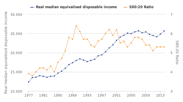
The main point of medianism is that economic measures should prioritize people more than money. That is why median income is a better measure than mean income. Similarly, when we display data about the distribution of economic wellbeing or democratic preferences on maps, they should be adjusted by making population-equalizing cartograms like this map showing the 2012 presidential election in which the area of each state is drawn proportional to its population.

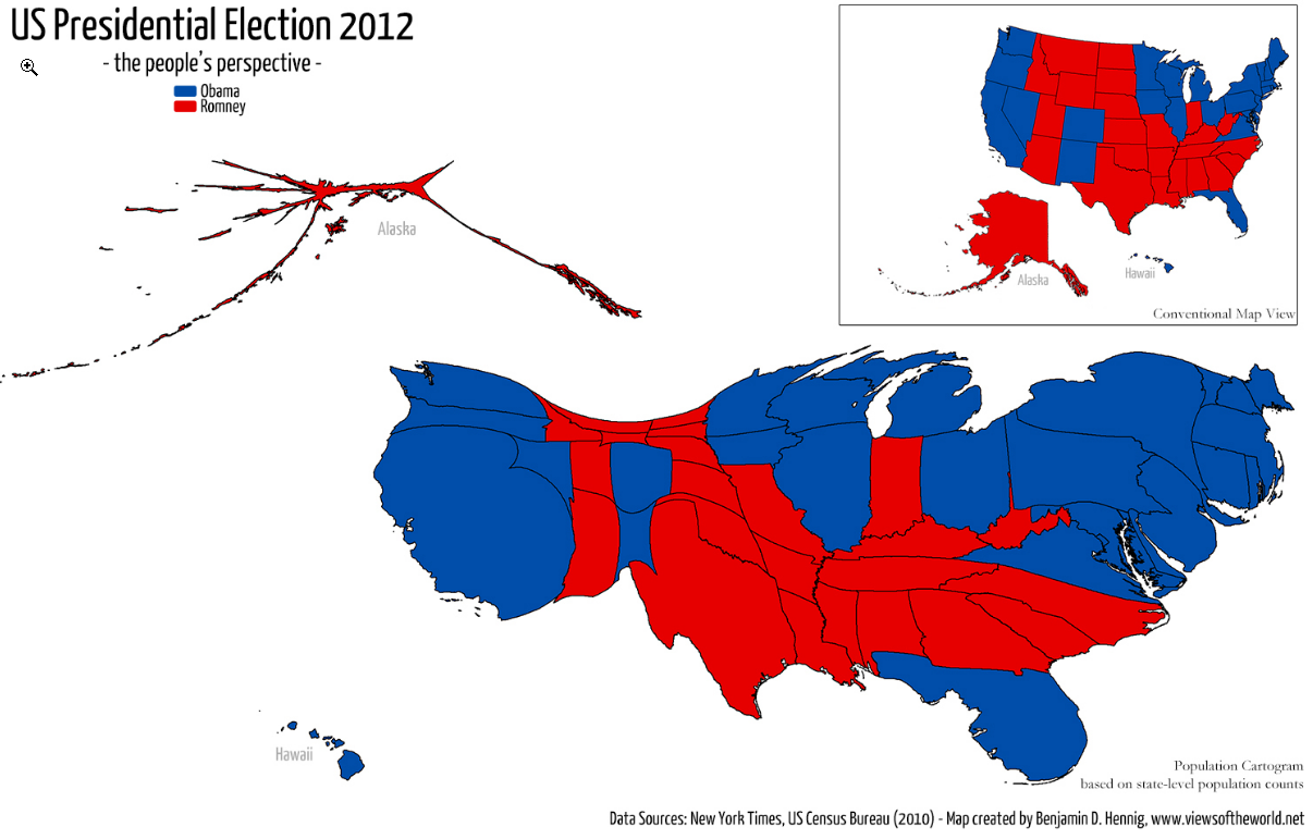
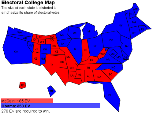
It looks crazy distorted, but you should get used this kind of map because it is a better way to graphically display the political preferences of America. The traditional political map in the upper right corner makes America look a lot redder than it actually was.  The New York Times produced another alternative below that has the advantage of making the population of each state more comparable by displaying each state as a square. That makes it clearer that Ohio is bigger than Virginia and Hawaii is bigger than Alaska, but I prefer the cartography above because it is more elegant, it doesn’t require state labels because their shapes are easily recognizable, and it shows the geographic distribution of the voters more accurately which is usually the main point of a map. West Virginia isn’t really located south of Virginia and adjacent to Georgia like in the NYT map below.

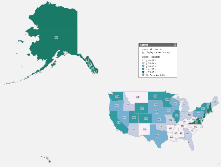
Making area proportional to population would also be a better way to show the distribution of economic variables like median income that mainly impact people rather than acres of land. The Saint Louis Federal Reserve has an excellent tool for mapping economic data called GEOFRED which should be displayed according to population rather than according to geographic area. People think of their map as being realistic, but all maps are distorted simplifications. The point of mapping is to select simplifications that communicate the most useful information. For example, the True Size Of website illustrates how any flat map is distorted because it is a projection of a curved surface. The standard maps that we usually see arbitrarily inflate the size of Alaska and shrink the size of Hawaii relative to the mainland US. Below is an example of the standard mapping projection used by the Saint Louis Fed which displays Alaska and Hawaii alongside the mainland with such distorted areas that they should look ridiculous, but it probably doesn’t because most people are used to it.

On the Fed’s map, Alaska looks bigger than half of the mainland USA when in reality, as the map below shows, Alaska is only about double the area of Texas.

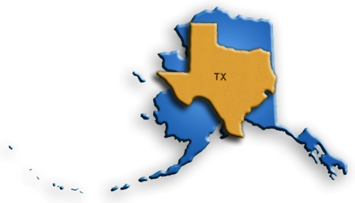
But even this greatly overstates the size of Alaska in terms of human welfare. By population, Texas is over 37 times larger than Alaska, so a map showing human dimensions should show Texas as being 37 times bigger to reflect its human importance.

The population of the US is distributed very unevenly within states as well. About half the population of Illinois is in in the county where Chicago is located and over half the population of New York state is in its southern corner where the New York City metropolitan area is located. Because congressional areas are divided up to have fairly equal population, some congressional districts encompass enormous states like Montana and Alaska whereas the smallest districts would fit in a square that is less than four miles long. When the size of congressional districts is adjusted for population, they should all be approximately the same size because they should ideally have approximately the same population as you can see in this fascinating cartogram by Benjamin Hennig.

The large map on the bottom is a much more accurate representation of the distribution of political strength than the comparable geographic map seen to its upper right. You probably think it doesn’t even look like the USA, but that is only because it is brand new and you aren’t used to looking at it. If more people created this kind of map, we would get used to it and we could also figure out better ways to draw them. For example, it would be easy to make the shape of Alaska look more like Alaska and less like a spider. That would make it evident that Alaska is only about half the size of Hawaii in population. On this map, Alaska is so stretched out, it artificially looks much larger than Hawaii. This map is particularly bizarre because it shows congressional districts which are often stretched into bizarre shapes due to gerrymandering and nobody recognizes their bizarre shapes. They create arbitrary divisions that act a bit like camouflage on the map for people who aren’t familiar with them. When they are erased, and only the population density is displayed, then the cities where most Americans live naturally pop out of the map.

Worldmapper.org has created hundreds of wonderful cartograms for the globe and the following USA cartogram is more intuitive and less messy than the red and blue one above because it eliminates the gerrymandered congressional districts and instead shows lightly-populated rural areas as shrunken dark lines in between lighter-colored cities.

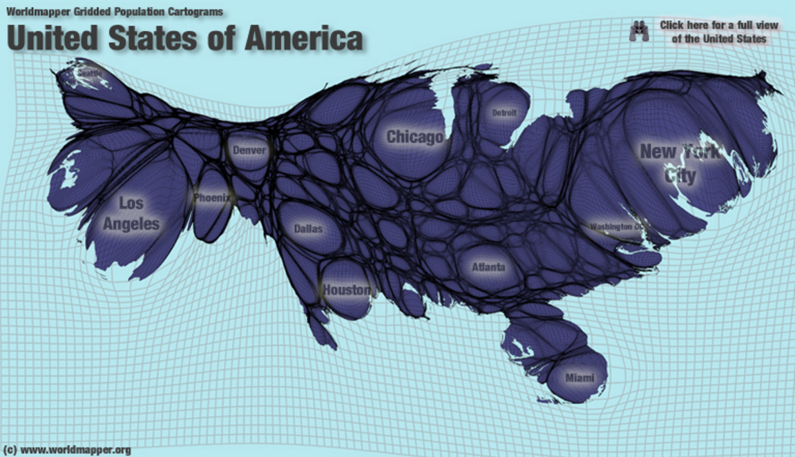
Although this kind of map takes getting used to, it soon becomes easy to identify major metropolitan regions even when they are unlabeled. This map gives insight into our economics that regular maps cannot. For example, it is easier to see the distance between metropolitan areas on this map by the amount of darkness between them. You can see the relative size of the conurbations of the Boston-DC megapolis and which are the closest together.

Toledo is the city just south of Detroit and then there are two bigger metropolitan areas directly south (and a bit west) of Toledo that are so close together, they look like twin cities with only a faint rural membrane separating them. They are Dayton and Cincinnati on the north and south respectively. Whereas the city of Dayton officially has less than half of the population of Toledo, this map accurately shows that its metropolitan area is much bigger than Toledo’s metropolitan area because Dayton has bigger suburbs. That helps explain why the Dayton airport is MUCH bigger than the Toledo airport. It would be interesting to see the locations of major airports superimposed on this map. Then you could see that the Dayton airport is inflated by the fact that it has little competition from the Cincinnati airport which is located in the rural southern edge of the metropolitan area and the Toledo airport is shrunken by competition from the Detroit airport which is nearby in the rural border between these two metropolitan areas.

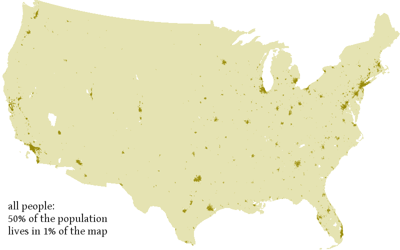
About 2/3 of Americans live in only 4% of our land area and 50% of Americans live on 1% of our land as you can see in this map by Joshua Tauberer, who wrote an excellent article in favor of cartograms. The dark dots on the map below should account for 50% of the area on any map that is trying to represent human geography rather than empty acres of land. That is what the cartograms above do.

Gapminder also prioritizes human populations on all of its default graphs and maps. Below is a Gapminder world map of income, denoted by the color spectrum, and the population of each nation denoted using areas of circles rather than stretching the areas like in the above cartograms. This works fairly well for comparing the relative populations of spread-out countries like Mexico, Canada, and the US, but it fails for the region around China and India where those two giant circles blot out the map.

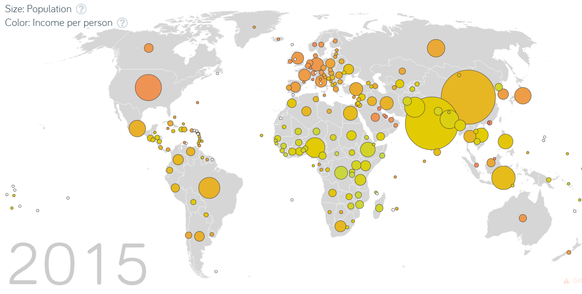
I think worldmapper’s map is a more elegant and realistic way to show the population distribution, but unlike in the Gapminder map, this time the colors are arbitrary.

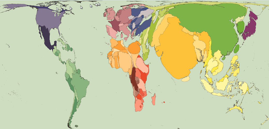
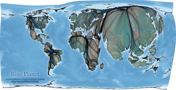
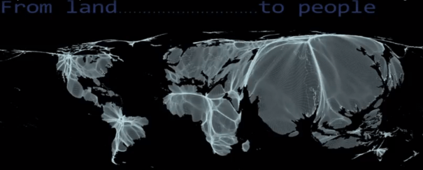
This map could still use work to make it more useful. For example, compare its representation of the US population distribution to the more accurate map above of just the US population that Worldmapper produced. Alaska hardly has any people in it, but it is ridiculously inflated in this Worldmapper map of the world, and the eastern US should be a lot bigger than the Great Plains and intermountain west.  Benjamin Hennig has also created another version that more accurately shows population distribution within nations too.  The one below shows how rivers run through the peoples of the world, and I also posted an even more beautiful version showing elevations on another post.

the-rivers-run-through-the-people

Benjamin Hennig also made a YouTube animation showing a map transforming from prioritizing the distribution of land to the distribution of people.  Here is a still from the video:

from-land-to-people

Soo Oh wrote a “case against cartograms” like these and she has a lot of professional credibility as Vox’s map builder, but it is a very weak case. She made has two basic points: 1. Cartograms are new and unfamiliar which makes it harder to find a geographic region like Iowa on them, and 2. People are bad at making cardinal comparisons between different areas, so area doesn’t matter much.

Her first complaint was aimed at the blocky New York Times cartogram displayed above, but it doesn’t seem like a significant difficulty to me. The NYT solved the problem by simply labelling each square. It doesn’t apply to the Gapminder map above nor to the first cartogram in this essay which roughly maintained the shapes of each state so that they are quite recognizable despite their unfamiliar sizes (except perhaps Alaska which is still identifiable due to its location). This kind of cartogram could be made even more recognizable with a little tweaking of some states’ shapes, particularly Alaska as mentioned above. Furthermore, it is only unfamiliar because nobody uses it. If cartographers like Soo Oh would use it more often, she would demolish hew own complaint because it would soon become easy to find Iowa on the map.

Soo Oh made the second complaint in two different formulations. It is true that people are poor at perceiving the cardinal magnitude of different areas, but we are pretty good at perceiving the ordinal magnitude, so we can still benefit from cartograms with areas that have meaning. For example, It is easy to look at the Gapminder map and see the ordinal differences in size: China’s population circle is bigger than the US which is bigger than Canada’s. It is hard to see accurate cardinal comparisons which would reveal that China is about 4 times larger than the US which is about ten times larger than Canada. Nevertheless, when we care about people more than acres of land, which is true for any map related to the geographic distribution of votes or economic wellbeing, then population-equalizing cartograms are much more accurate than regular maps. Ironically, in Soo Oh’s case against cartograms, she links to an example of the kind of cartogram that she makes, and her own cartogram is worse by her own standards than the ones that she complains about. It is so distorted that it is even harder to find Iowa and other particular states than in any of the cartograms on this page and because each state is exactly the same size, the areas are even more distorted and less useful than in the cartograms she criticizes or traditional maps. There are many tradeoffs in cartography between what kinds of information to prioritize. I advocate for prioritizing the geography of human populations over the geography of empty acres when we are mapping economic welfare or democratic representation. Here she mapped a change in economic welfare and eliminated useful geographic information without adding anything at all.

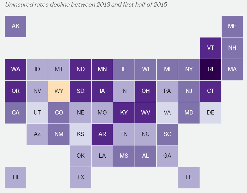
This preserves the worst of both cartograms and traditional maps. It would be much more useful to display the geographic distribution of the welfare of uninsured Americans if she had just color-coded the map at the beginning of this essay that Benjamin Hennig created for the 2012 election. It isn’t perfect, but it is the best population-weighed cartogram of US states and it should be the standard upon which we should try to build new and improved cartograms.

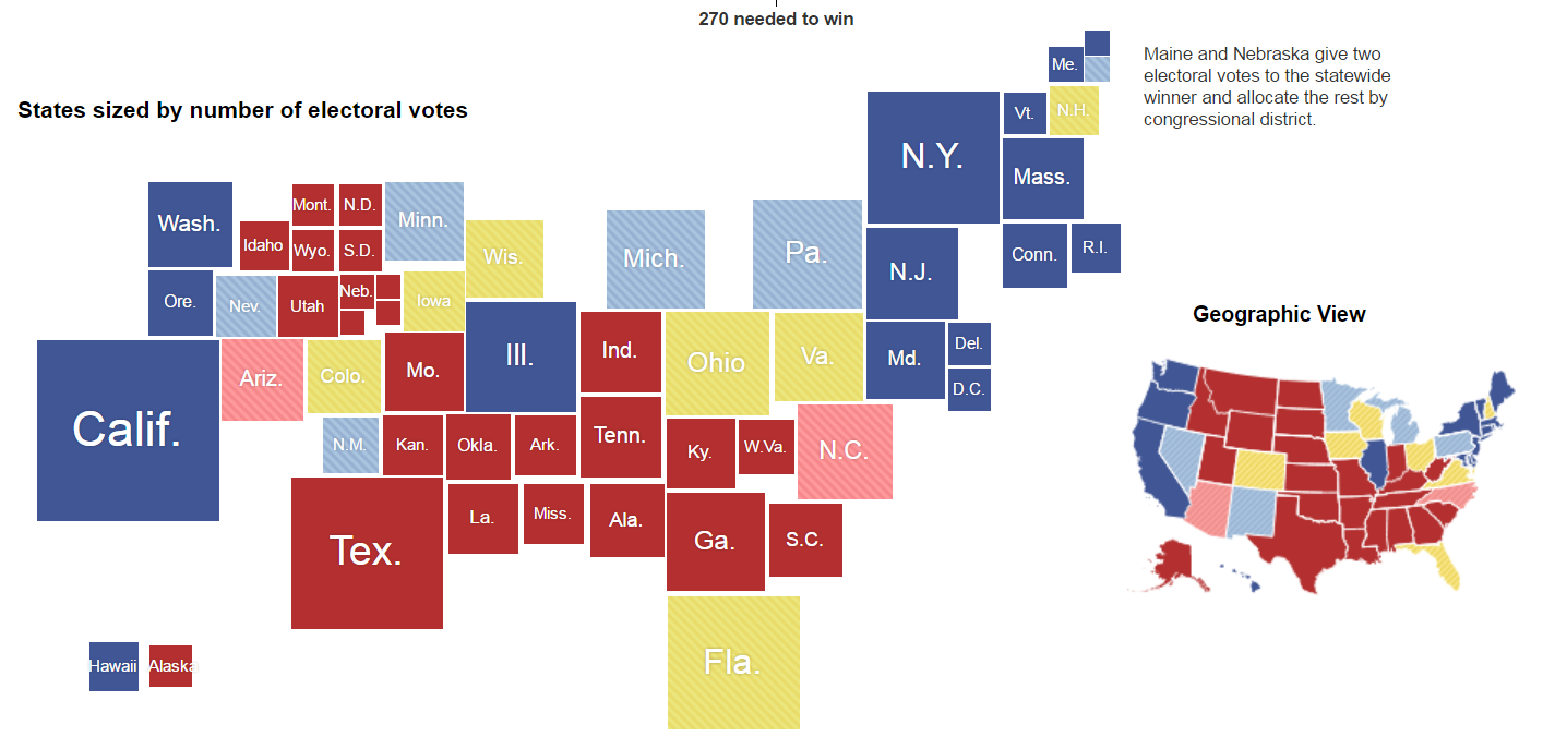
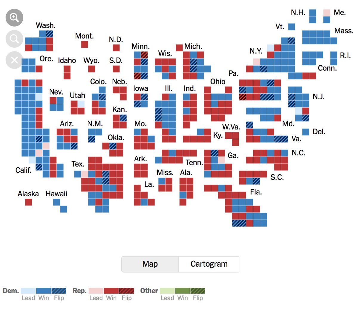
Here is another example of a population-area map by Sam Wang, who does excellent polling work using the median poll:

PEC

It is more blocky than the Woldmapper maps which makes it easier to see relative sizes of the states.  For example, it clearly shows that Hawaii is larger than Alaska.  But it isn’t as blocky as the NYT map, so you can still identify the states by just looking at their shapes.  I think there is more work to be done to create the best tradeoff between stylized blocks (or circles like Gapminder’s map) and stretched geograpic shapes like Worldmapper, but this is better than the standard projection that Sam Wang usually uses

Webcomic XKCD author Randall Munroe produced a nice map by putting people into the geographic map to show both area and population:

2016_election_map

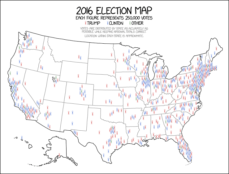
Alan Cole argues that it is the best way to draw a political map among several other alternatives that he presents.

Finally, below is a good way to display the house vote in the 2018 midterm election.  Unfortunately it overstates the population of places like Wyoming and understates others like the District of Colombia, but that is because our democratic system is biased and this cartogram is accurately displaying the distribution of political power. 

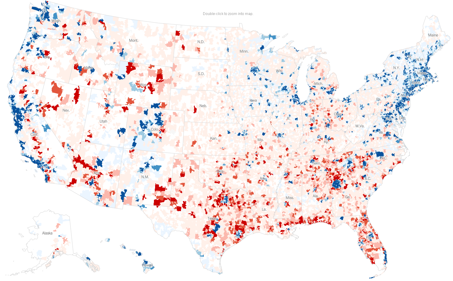
Finally, this map of political donations by zip codes shows what a purple country the US is. There are significant red areas in “blue” states and significant blue areas in “red” states.

Update: My next post shows a mmutilitarian map of the world.

Update 2: The Sightline Institute gives several other alternatives.

Posted in Medianism

Millionaire Superheros: Henry Heimlich

Henry Heimlich’s biggest innovation is famous: the Heimlich maneuver for saving people from choking.  The Deaconess Institute estimates it has saved 50,000 lives in the US and since the US is less than 5% of world population, it is likely that the technique has saved many times that number around the world.  The Heimlich maneuver is so simple and well known, it would seem like a timeless idea, but he only published the technique in 1974 and the first life saved was in June of that year.  There is a lot of potential because choking is the fourth leading cause of death by accidental injury in the United States.  Heimlich also invented the flutter valve which may have also saved hundreds of thousands of lives and some other successful medical innovations.

Unfortunately, Dr. Heimlich’s brand was tarnished in the 1980s and 90s when he turned towards quackery later in life, most notably in claiming a dangerous ‘cure’ for some of the diseases that had captured the public attention during the era: AIDS, Lyme disease, and cancer.  He proposed that he could cure these diseases by simply infecting sick patients with malaria without seeming to realize that the combination of malaria and AIDS is known to be particularly deadly in African nations where both have long been endemic. Fortunately, America’s regulatory infrastructure prevented him from killing people with his quackery in the US, and unlike his successful innovations, his quackery has not found a significant following.  If his quackery did cause a few deaths, they are insignificant compared to the hundreds of thousands of lives that he has helped save.

Heimlich’s work might not have saved a million lives yet, but he is certainly well on his way.  Radiolab did a wonderful episode about Heimlich’s life and his innovation.  I got choked up hearing a school nurse read a letter she wrote to a student whose life she saved using the Heimlich maneuver.

Posted in Millionaire Superheroes

A new indicator of economic development: How many years would you work to buy your life?

Although most people find it distasteful to put a dollar value on human life, people have been doing it for centuries and these judgements have always had a big impact on people.   Before the 1960s, the motivation for putting an economic value on human life was for buying and selling human beings either as slaves or as payment to compensate a family for a member’s death as documented in Alfred Hofflander’s short history (1966). This motivation led to the oldest methodology for for putting a dollar value on people’s lives.  It is to simply estimate how much income a person would earn if he or she had lived or perhaps just the net income after subtracting personal consumption.  As primitive and ethically questionable as this methodology might seem, it is still widely used in legal cases of wrongful death today.  It doesn’t seem fair that the US legal system literally judges the life of a high-income vulture capitalist to be thousands of times more valuable than the life of a full-time homemaker taking care of young children.  Most people’s lives are pretty cheap by this method because a majority of Americans don’t work for wages at any given point in time and many of the Americans who are working, don’t earn very much.

In the 1950s, RAND corporation economists developed a new methodology for valuing life because they had a new kind of motivation: how much to spend on saving lives. They were trying to help the US military make decisions using cost-benefit analysis and one of the major costs of warfare is the value of lives lost.  Two RAND economists, Jack Carlson, and his advisor, Thomas Schelling, developed the idea of evaluating the monetary value of life based upon the individual choices that people make every day.  For example, when there are two equivalent jobs like driving a skid steer in an underground coal mine versus in an ordinary highway project, workers will only choose the riskier job if it pays higher wages.  If the coal miners require $2,000/year higher wage to accept a slightly higher probability of death (say, 0.0002/year), then it is easy to calculate their value of life:

(Probability of death)*(Value of life) = (Expected value of taking on the additional risk)

Plugging in the numbers we get:

(0.0002)*(Value of life) = $2,000

Solve for the Value of life and you get:

(Value of life) = $2,000/(0.0002) = $10,000,000

This is basically how economists calculate the value of a life.  Assuming people are risk neutral, then those who do not take the coal-mining job must value their lives above $10m and the coal miners must value their lives at less than $10m.  It is a crude estimate, but perhaps it is better than nothing.  The same sort of calculation has been done for all sorts of risks that everyday people pay to avoid.  For example, airbags used to be an optional safety feature in cars, so economists could calculate how much people value their lives at when they buy airbags.  The same can be done for the purchase of fire alarms and a whole slew of choices that we all make.  Similarly, economists also take surveys to ask how much people would be willing to pay for safety equipment and use that information in the same manner.

Unfortunately, people’s choices vary widely in different scenarios and that makes it difficult to pinpoint the average statistical value of a life.  Some studies value life at orders of magnitude greater than other studies.  Policymakers need a value of life because it provides guideline for how much government money to spend cleaning arsenic out of our water and keeping mad-cow disease out of our food supply.  Without some kind of rule, they will waste both money and lives.  For example, if we spend $12.5 million per life cleaning up paper-mill pollution instead of spending $3 million per life on air travel precautions, then we would be wasting money on paper mills that could have saved four times more lives if it had been spent on airlines.  Unfortunately, our policymakers have not been able to agree upon a single statistical value of a life, so different government agencies spend different amounts on our health and safety.

vsl

One of the huge problems with both methodologies for estimating the economic value of life is the fact that they value the lives of rich people as being worth more than the less fortunate.

This is obvious in the old methodology that judges a rich vulture capitalist’s life as being more valuable than a homemaker, but it is also true for the new methodology because richer people are able to spend a lot more money on safety and are not willing to work at risky jobs. For example, Donald Trump talks a lot about how he wants to create a lot more American coal mining jobs, but imagine what wage it would take to get him to work in one of those dangerous coal mines.  He probably wouldn’t even do it for $1,000/hr because that would only earn $2 million per year.  The mmutilitarian logic of economics thus judges that Donald Trump’s life is worth many times more than coal miners’ lives.  Fortunately, most economists are loathe to take their own logic to its natural conclusion and make these kinds of controversial judgements.  Instead, they usually switch to a remarkably egalitarian recommendation.  First they estimate an average value of life for a population (including Trump and the coal miners) and then they treat all lives in the population as being worth the the average.  As A. Markandya says, “different values attached to the deaths of the rich and the poor …would, rightly, be seen as immoral. …no one even thinks of taking different values for the deaths of the rich and the poor citizens” when making policies that affect a nation.

That is the logic in the chart above.  Different government agencies don’t agree on a single value, but each agency treats all American lives equally.  The EPA treated every American’s life as being worth $9.1 million in 2010 and the CPSC treated everyone as being worth about $5 million.

Although economists have avoided political controversy by valuing every life in a given population the same, there is no controversy in economics to the idea that different populations have vastly different values of life.  For example, the literature uniformly agrees that each American life is worth more real dollars today than life was worth in 1970.  Everyone agrees that life has been getting more valuable because nobody complains about that optimistic judgement which implies economic progress. Similarly, there is only a little more controversy over the idea that lives in rich countries are worth more than lives in poor countries because we aren’t sharing government expenditures internationally.

→→→
Read more ›

Posted in Development, Health, Inequality, Medianism, MELI & Econ Stats, Public Finance

A list of notable attempts to go beyond GDP

I have only about three more months left in my sabbatical in which to figure out how to promote MELI as a replacement for GDP.  I have spent much of the past week researching other attempts to replace GDP and just making a list of all the other attempts is daunting, but today I posted a page of the most significant attempts to replace GDP that I know of so far.  It is skewed towards attempts that are the most relevant to the present which means that I have left off a lot of important work that was done decades ago and included some recent attempts that will probably turn out to be fairly trivial to people in future decades.

In this research, I have identified a number of organizations that could be helpful partners in developing MELI and the optimist in me is heartened by seeing the advantages I have due to all the ways in which MELI is different than all the failed attempts.  The realist looks at the failures of governments, foundations, and multilateral institutions who haven’t been able to go beyond GDP and figures MELI doesn’t have a snowball’s chance in hell.  Well, I guess I’m joining a long list of starry-eyed idealists who have been tilting at the GDP windmill.

Posted in MELI & Econ Stats

Sexual reproduction is rapidly coming to an end.

In Scientific American, Holly Dunsworth wrote that homo sapiens is the only species that understands the birds and the bees.  Even apes don’t comprehend the concept that sex leads to babies.  Animals don’t need to understand  it because they are motivated by instincts.  All they need to know is that they like to have sex and the rest works out just fine for the preservation of the species.  Humans behave differently from other animals as a consequence of understanding of the mechanisms of reproduction and this knowledge directly causes a lot of the qualities that separate humans from animals.  For example, humans develop greater life-long connections with relatives like brothers and sisters, and human males make longstanding connections with their children and they even encourage their children to produce grandchildren.  Most animals have no connection with family beyond a short period of parenting at most and some animals even eat their young when given the chance because they have little ability to recognize genetic familial relationships.  Large, fundamental chunks of human culture directly stem from our knowledge of the birds and the bees:  Patrilineal inheritance, hereditary monarchy, nepotism (in its original meaning), insults like “bastard,” trying to delay marriage/sex until reaching a degree of financial independence, infidelity norms, etc.

Primitive birth control methods would be feasible for apes.  For example, apes could use the withdrawal method or ape females could hide during their estrous period.  They could even attempt to end pregnancies that result from rape.   But they have no reason to do these things without knowledge of the birds and the bees.  In contrast, humans have always consciously tried to regulate fertility, but these efforts suddenly advanced in the past century because of new birth control technologies.  That caused a sexual revolution by separating sex from reproduction.

For all of history until the 1800s, women had more than 5 births on average despite the fact that life expectancy was only about 35.  Those were some busy mothers.  They spent most of their sexually active lives either being pregnant or nursing babies.  Today, the global average number of births per woman has fallen by more than half even though the average woman has more time for pregnancy because average female life expectancy has more than doubled and puberty is starting much younger.

Most of the drop in the global fertility occurred in just the past 50 years as sex has become increasingly divorced from reproduction.  In the next 50 years, Henry T. Greely argues that the knowledge of the birds and the bees could cause another sea change in human reproduction. He outlines his predictions in an article on VOX and in his book entitled, The End of Sex and the Future of Human Reproduction.

Sex is obviously still the primary means of human reproduction today, but it may be going out of fashion because IVF is rapidly taking its place.  So far only about 2.5% of American births are a result of IVF, but the numbers are growing rapidly despite high costs (about $15,000) and the painful procedures that are required right now.  Attitudes have changed rapidly.  Most Americans in the late 1970s when the first IVF experiments were successful thought that these “test-tube babies” were immoral.  The official Catholic position still says IVF is immoral, but most people no longer agree.  This will change further as new technologies promise to make it cheap and easy and it will allow prospective parents to eliminate genetic diseases as well as allow all sorts of other mind-blowing possibilities.  Human sexual reproduction rates have fallen by more than half in the past half century.  Greely argues that most of the rest of sexual reproduction could fall away in the next half century.  He suggests that our grandchildren may come to see zero connection between sex and reproduction.

Posted in Development

Chris House’s Soft Bigotry Of Low Expectations

University of Michigan economist, Chris House gave recommendations for the two most important economics writings for all Americans to read:

If I could dictate the reading habits of my fellow Americans, I might put Piketty’s Capital in the Twenty-First Century on the bedside table of every conservative but I would put Sargent’s 12 principles on the bedside table of every liberal.

These reading assignments are extremely odd bedfellows.  On the one hand, Pikkety’s bestselling book is the culmination of many years of original research and is difficult reading for non-economists.  On the other hand, Sargent’s commencement address has to be one of the shortest ever, at 335 words.  It is written at the 6th-grade reading level, and contains no new research at all.  Here is a comparison of their lengths:

sargent vs pikettySo Chris House wants all liberals to keep a one-minute read on their bedside tables and conservatives to read a massive magnum opus.  I’m not sure whether he is trying to insult conservatives or liberals more.

Sargent’s address is just a list of bullet points that are full of misleading statements.    For example, one of Sargent’s bullet points says:

In an equilibrium of a game or an economy, people are satisfied with their choices. That is why it is difficult for well-meaning outsiders to change things for better or worse.

Nonsense.  First, nobody can prove that the economy is in equilibrium.  Secondly, lots of people are unsatisfied with their choices due to unexpected random events or misinformation.   If I chose to live in a house that later got flattened by a tornado, I’ll feel some regret and I’ll welcome some help from from well-meaning outsiders.  And why couldn’t outsiders change anything “for better or worse”?  Try telling that to Donald Trump supporters.

Sargent’s 5th point says,

“There are tradeoffs between equality and efficiency.”

That is perpetuating one of the most harmful and misleading ideologies in economics.   There are many policies that increase both equality and efficiency, but economists like Sargent willfully disregard them.

Sargent’s 9th point is:

It is feasible for one generation to shift costs to subsequent ones. That is what national government debts and the U.S. social security system do

This is also misleading, but it requires a longer explanation to detail why.


Posted in Macro

Median individual income is still fairly stagnant, particularly for men.

The Census just announced a historically rapid rise in median household income which is cause for celebration, but the reason why it rose is a bit less heartening.  Basically, households are working more hours.  The median earnings of individuals is still somewhat stagnant:

Median Earnings of Full-Time, Year-Round Workers 15 Years and Older

male-vs-female-earnings

The report says that, “the 2015 real median earnings of men ($51,212) and women ($40,742) who worked full-time, year round increased 1.5 percent and 2.7 percent, respectively, between 2014 and 2015.” Median male earnings are particularly dismal having peaked in the early 1970s and being fairly stagnant ever since.  That may help explain why the Trump revolution is much more popular among men than women although it is hard to see why men would suddenly be wanting a radical political change now since male earnings are finally rising again.

Household income rose at 5.3% which is more than double the rise in median individual income shown above because of more employment per household:

workers

I’d rather see much higher earnings per person rather than just more people working, but hopefully our households feel good about the reasons they are working more hours.

Another reason the Census’ current estimate of household income is inflated is that they changed their survey methodology.  The new method might be more accurate, but it makes comparisons with previous years less accurate because they were measuring two slightly different things and we cannot really say that increase in the measure is due to rising income because much of it is probably due to changing methodology.  The new survey increased their measure of household median income by 3.2% so that could account for most of the apparent increase.

Since the mid 1970s, real mean income (blue line) has doubled in America, because America keeps getting more productive.  But whereas American workers are producing about twice as much per hour compared to the 1970s, the average worker’s income has been stagnant because of rising inequality.  Most of the income from our rising productivity has been going to wealthy elites.

mean-vs-median

Real median personal income (green) is only up about 25% and median wage/salary income (red) hasn’t changed at all.  If the median American wage had kept up with mean income,  average American workers would be making double their current salaries.  That would put the median full-time male salary up at around $100k/year!  Imagine how politics would look different in an America like that.

Stagnant median income is not inevitable.  Median income used to progress better in the US.  US inequality fell and median income rose dramatically from the 1930s until the 1970s, creating the golden age of middle-class America. That was a great accomplishment and it is one area where I’d like to Make America Great Again.

Because the median American lives in an age of diminished expectations, most of you probably think that it was completely unrealistic of me to suggest that real median income could have doubled to $100,000 since the mid 1970s, but it more than doubled in the UK from 1977 to 2014 (less than the time period on the above graph).  The blue line on the following graph shows median income in the UK.

uk-median-income

This is because the median income kept pace with mean income from 1990 to the present and almost kept up from 1977 until 1990:

uk-mean-median

Another way of showing what happened is to show that inequality did not increase much. It (the blue line) rose a bit from 1977 until 1990, but has remained steady since then.

uk-inequality

The UK’s accomplishment of doubling median income probably seems like a miracle to the average American, and some Americans probably put it in the same unfathomable category as the unbelievable economic growth in China during this period.  But the UK doubled median income without miraculous economic growth.  Their per-capita income rose at about the same rate as in the US.

Posted in Inequality, Medianism

Enter your email address to follow this blog and receive notifications of new posts by email.

Join 75 other subscribers
Blog Archive
Pages