The Fed Needs A Better Dashboard

The Brookings Institution updated a good article  earlier this month showing the dashboard that the Federal Reserve leadership uses to steer the US economy using the “most important[¡¿]” measures.  This “array of gauges” gives useful information, but it lacks anything about the median American and some, like GDP, are particularly skewed towards the well being of elites.  Even worse than GDP is what Brookings calls its measures of “household wealth”:

Household Wealth

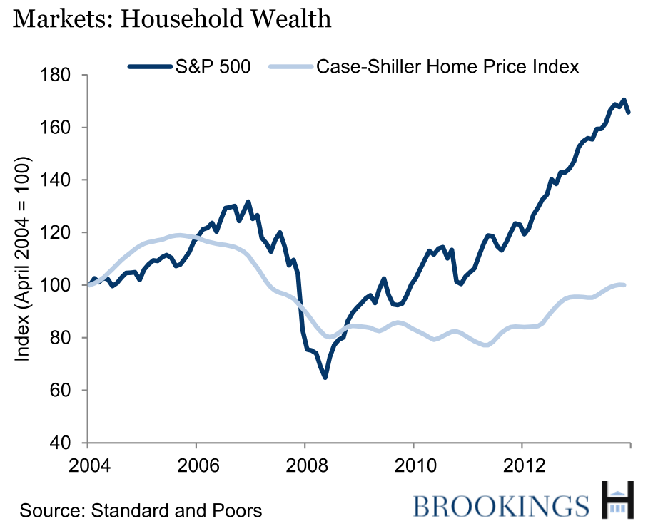
These measures are very far from measuring the household wealth of the average American.  The median American has more wealth tied up in the rapidly depreciating vehicles in her driveway than in the stock market, so the S&P500 stock market index has little relevance to the median American.

The other indicator on the graph measures housing prices.  That is much more important to median well being than the S&P500, but it is still a bad measure.  This measure is inflated by including the total value of mansions and second homes in the total stock of housing wealth.  Bill Gates’ homes are worth more than the equity of probably a third of American households, because almost a third of households rent, so a rise in the price of housing is purely bad for them.  But even for most people who have bought a home, higher home prices do not help because most people only have one home and they need to live in it.  A rising house price would only be useful for a homeowner who could find somewhere cheaper to live, but if all home values rise, then nobody can sell his home and become better off by finding a better deal somewhere else.  Only people who want to downsize into a smaller home could benefit.  At the extreme, someone who wanted to sell his house and became homeless would clearly benefit from higher housing prices, but this is a bit absurd.  For most people, housing is a strongly normal good. That means that as wealth increases, they spend more on housing.  Thus, as housing wealth increases, most people just spend more of their new wealth on the housing that they are already living in rather than downsizing, and they are no better off.

Housing is more of a consumption good than a store of wealth for most households.  Only elites who have extra homes could see housing as primarily a store of wealth.  The Fed leadership probably has extra homes because they are all well above the median income and they probably have fat stock portfolios too.  When the Fed leadership uses housing and stock prices to measure economic wellbeing, they are using meaningful measures for elites like themselves, but not for the median.  The Fed leadership doesn’t care about measuring their effect on the median American.  And that is one reason why the Fed leadership doesn’t really care about unemployment either.

Tagged with: ,
Posted in Medianism

One Unconventional Monetary Policy That The Conventional Wisdom Ignores

Let’s play word association.  If I say, “unconventional monetary policy,” what is the first thing that comes to mind?   If you are like most pundits and economists, you probably thought about phrases like quantitative easing, operation twist, NGDP targeting, large-scale asset purchases, or ‘forward guidance’–the signaling of low, low future interest rates.  A Google search for “unconventional monetary policy,” gives results about unconventional ways to expand the money supply and lower real interest rates by lending out more money.

But there is another form of unconventional monetary policy that is so unconventional that it has never been done before in history.  And it has the exact opposite effect of everything listed above.  At the same time in 2008 when the Fed started “unconventionally” lending vast new quantities of money out to the banks, the Fed also started a new program to dramatically increase vast borrowing from the banks!   One hand lent while the other hand borrowed it all back.  The Fed borrowing from the banks is contractionary monetary policy and when the history of the Great Recession is written, this will surely be cited as one of the stupidest monetary-policy mistakes that we have been making.  For the first time in history, the Fed has been borrowing enormous amounts of excess reserves from the banking system and this has probably contracted the real money supply by increasing reserves.  The Fed got the banks to loan it money by paying interest on their excess reserves for the first time ever.

One of the great academic mysteries about quantitative easing (and similar conventional forms of unconventional monetary policy) is why it is so ineffective.  But surely one reason in this case is that quantitative easing has been working against the unconventional contractionary policies that have been increasing bank reserves.  Whereas pundits and economists are gushing with advice about whether to expand or contract quantitative easing, hardly anyone ever suggests that the Fed should stop paying banks to hoard excess reserves.  Google News has 19,400 results for “quantitative easing” which is only one of the many conventional forms of unconventional monetary policy, versus only 575 results for “excess reserves.”  And almost all of the Google results about “excess reserves” are red herrings because they don’t mention the radically unconventional Fed policy of paying interest on them.  Nobody is talking about it.

Bloomberg’s Max Raskin and Joshua Zumbrun wrote one of the few articles about it and they estimated that:

The Federal Reserve could pay more than $77 billion a year in interest on the excess cash reserves it holds for commercial banks…

“Essentially the Fed paid the banks $4 billion last year, which is about $12 per American,” David Howden, a professor of economics at Saint Louis University’s campus in Madrid, Spain, said in an e-mail.

Howden analyzed interest on reserve payments so far for the [conservative] Ludwig von Mises Institute…

“If your bank called you up and said you have a new service fee of $12 because they screwed up in the crisis, you’d be livid, but that is basically what they are doing and no one knows about it.”

Ending excess reserves should be a no-brainer that both conservatives and liberals can agree upon.  Conservatives should like it because it would be a return to our traditional policy with a long experience of safety and prudence.  And it is an alternative to the kind of stimulus that their liberal opponents tend to propose: increased government spending.  Liberals should like it because it could help the poor and reduce unemployment.  Populists on both the right and the left should like it because it would eliminate a huge government subsidy that the Fed has been paying to pad the record profits of elite banksters.  Fiscal conservatives should like eliminating the subsidy because it would help reduce the federal deficit.  The only possible drawback is increased inflation, but the conservative market monetarists are right that the Fed should increase inflation because it could help stimulate economic growth and reduce unemployment.

A lot of economists have been surprised that five years of quantitative easing have failed to spark inflation.  Some economists have gone so far as to argue that this demonstrates that the Fed is unable to increase inflation.  This seems ridiculous given that every poorly-managed central bank in every 3rd-world banana republic has always been able to increase inflation even without trying.  The Fed has never stated that it has any interest in increasing inflation and the Fed shows that it isn’t really trying because it is paying interest on reserves to keep inflation down.

Whereas excess reserves have been a target for criticism from inflation hawks, unemployment hawks have mostly been silent about the matter.  Thus, most of the few people who are discussing excess reserves are complaining that reducing them might increase inflation and there is little push-back from people who want Fed policy to focus more on reducing unemployment and increasing economic growth.

If the Fed cared more about unemployment than inflation, it could do a simple experiment to see who is right about inflation and excess reserves.  Reduce the interest payments to the banks (which ultimately reduces a burden on taxpayers) and see if it does anything to increase inflation and/or reduce unemployment.  Nobody could even call it a risky, unconventional action, because it would merely be a return to longstanding normalcy.

Update:  Some central banks (like Sweden’s) went with the opposite policy and started charging banks interest on their reserves instead of paying interest.  In effect, they have been taxing banks for keeping money out of circulation to try to expand the money supply.  It hasn’t had a huge effect because they are only charging tiny interest rates, but even tiny amounts can help a little.

Tagged with: , ,
Posted in Macro

Pew Stokes Racial Tensions While Median Wealth Stagnates

Yesterday the Pew Research Center released analysis based on new Fed data that shows that median black net worth is less than it was thirty years ago.  Median net worth for whites has grown an average of about 1% over that time period.*  One percent is a really bad rate of return.  The top 1% have seen their wealth skyrocket, so middle class (median) households have either been spending down their wealth or else investing in really lousy investments compared to richer American households.

Pew wealthGap2Pew’s headline is that the gap between black and white households has risen, but that is an unnecessarily divisive way to look at the data.  As you can see from the chart, there has not been much change in the relative fortunes of middle class blacks and middle class whites.  The big story is the skyrocketing gap between middle class Americans and rich Americans during this time period.

The gap between races is unjust and important, but focusing on that might be counterproductive for helping reduce it because it is small potatoes compared to the unjust gap between the rich and the median (and poorer folks) and it stokes racial resentment that divides the masses.  Middle class people of all races will gain from policies that benefit the middle class (and poorer folks).  Unfortunately, many whites (perhaps like my relative mentioned earlier) are focused upon preventing efforts to help black people rather than focusing on efforts to help everyone who is below the median.  Whites now mistakenly think that anti-white racism is a bigger problem than anti-black racism!  And they mostly think that whites and blacks are in a zero sum game in which a gain for blacks can only come at the expense of whites and vice versa.  The racial gap isn’t the gap that middle class whites should be focusing on.  As the charts above show, middle class fortunes for all races generally run in tandem.  Unfortunately, the Pew graph does not show data for the rise in the wealth of the top 1%, but it would make the above change in the racial gap look like nothing.

[UPDATE 12/14 – Added a bit more explanation below.]

The big reason why the racial gap has increased in the past three decades doesn’t have anything to do with race.  Increasing inequality is the main problem.  When inequality rises evenly, the gap between poor people and the middle class will rise.  Because blacks are poorer than whites, rising inequality will tend to increase the gap between blacks and whites.  That is the big story that Pew ignores.  The problem is an increasing gap between classes of all races. Focusing on racial gaps risks exacerbating the kind of racial divisions that have often prevented populist solidarity in American history.  Middle class Americans have enormous political power and when they focus on racial divisions, they are less likely to join together to seek economic policies that strengthen the middle class (and below).

The economic gap between the races in America is an important justice issue, but it is more politically productive to focus on economic justice rather than racial justice when seeking economic goals because that will broaden the political coalition.   And the middle class is the most politically popular class in America, which is why Medianism is all about helping people in the middle… and below.  Helping the middle class is much more politically tenable than helping the poor.  Nearly half of Americans don’t particularly like the poor and think they have too much help already.  One of the reasons that Obamacare is unpopular is that it is seen as a program to help poor people.  Most middle-class people already had health insurance and see most of the benefits going to those other people (the kind of people are are also getting Obamaphones).

Programs that help both the middle class and the poor actually spend more money helping the poor because they are more politically popular.  Public education is aimed at helping the middle class, but for most of American history, public education has been the biggest anti-poverty spending program in America.  Medicare and Social Security are also aimed at helping the middle class, but they are both spend more on poor people than the programs that Americans traditionally call ‘welfare programs’.  Medicaid is the largest spending program that is sometimes called ‘welfare’, and one reason it is relatively popular is because much of its spending helps people who spend most of their lives in the middle class.  That helps make it more popular than programs that are more targeted at the poor.  About a third of Medicaid pays for long-term care in nursing homes and most of those old folks used to be middle class.  Medicaid also pays for about half of all births in America and you can’t cover half of all new mothers without covering a lot of people who see themselves as members of the middle class.

Because these programs all help reduce inequality, they all help reduce the racial gap.  Nobody thinks of them as anti-racism programs, but they are.

*My numbers are ‘real,’ meaning they are adjusted for inflation.

Posted in Discrimination, Inequality, Medianism

Lies (or Stupidity), Damned Lies (or Stupidity), and Statistics

A family member who has a history of opposition to efforts to reduce racial discrimination emailed me an article by Paul Sperry entitled, “Eric Holder believes all cops are racists…”  Sperry claims that Holder’s efforts to reduce unconscious racial bias have caused Seattle police officers, “to ignore signs of criminal behavior and threat indicators they’ve gleaned from years of street experience.”  Sperry says that attempts to reduce discrimination by police officers, “puts their own lives in danger — and risks the safety of residents.”  Sperry claims that anti-discrimination efforts among the Seattle police have been a disaster:

Since Holder stepped in, crime is up 13% overall in Seattle. But it’s not just minor infractions. It’s the biggies — aggravated assaults up 14%, car theft up a whopping 44% and murders up 21%.

Those statistics immediately piqued my interest because it is really hard to get crime rates to swing that much, so I checked them.  Sperry provided lots of links, but oddly, he didn’t link to any sources for his statistics, so we will probably never know where he got his data.  But I searched Google and the first article I found at the top of my Google search was a column from the Seattle Times last week that points out that crime statistics fluctuate by these sorts of magnitude (13%-44%) from month to month all the time.  Sperry attributes the large (13%-44%) increases in crime to the changes that Holder started making in 2012, but it is hard to make annual crime statistics fluctuate by 13% or more.  And a 21% increase in annual murders would be big-time national news.  I’m guessing that Sperry carefully selected a month for his article where he found big random changes in the statistics because I looked at the last year of data and found pretty much what I would expect.  Monthly stats randomly swing by large amounts, but the annual trend in the latest crime data for the past year is very small.  The annual change is much smaller than the variance (monthly swings) which means that there probably isn’t any statistically significant trend over the past year at all.

Sperry’s article is a good example of how statistics make smart people smarter, and stupid people stupider. It is harder to lie with statistics than to lie with stories because in the information age it is easier to check statistics than to check stories.  Paul Sperry is either stupid or lying to his readers.  Either way, his use of statistics makes it really easy to discredit him with a quick Google search and that makes us all smarter.  Now we know that we should not trust him nor his publisher.  His publisher is the New York Post which is literally the Fox News of newspapers.  Both are run by Rupert Murdoch.  My sister also said that there is a graph of Seattle crime data in the article, but it wasn’t there a few hours later when I looked.  ¡¿It is weird that the New York Post took data out of their article without explanation, huh? A reputable newspaper would post a correction when they make a substantive change to an article. Otherwise, readers who email relatives about the article will look stupid when their source alters the story and hides part of the original work.[Update: My sister emails to say that she probably saw the graph somewhere else and wrote the source wrong.]

Mark Twain complained about “lies, damned lies, and statistics”, but that was a long time ago when statistics were nearly impossible to check.  Today I might have found Sperry’s story to be plausible if not for his stupid use of easy-to-check statistics.  Without his dramatic statistics, his claims fall apart, so maybe Seattle’s efforts to reduce discrimination are worthwhile after all.

Similarly, Darrell Huff who authored the bestselling book, How To Lie With Statistics, was paid by the tobacco companies to lie to Congress twice to try to deny the growing evidence that tobacco causes cancer.  Although Huff undoubtedly helped Big Tobacco’s battle temporarily, they still lost the war and the truth of statistics won.  Huff made a little money, but he permanently tarnished his legacy and lost credibility.

Tagged with:
Posted in Discrimination, Inequality

The Fed Finally Adds Median Income To Its Data

I have given formal presentations about medianism in 4 different countries in 2014: the USA, Lebanon, Mexico, and now Canada.  Two weeks ago I presented at the Mennonite Economic Development Associates (MEDA) Convention in Winnipeg Canada. A lot of the presenters and informal conversations talked about declining median income in the US.   I had not heard much mention of median income at previous MEDA conferences so median income is catching on.  But MEDA is a group that intuitively understands something about medianism because it is a group of businesspeople who cares about both the common good and about the poor in particular.

While gathering data for my MEDA presentation, I checked the US Federal Reserve’s wonderful database of economic statistics (FRED) and found that they finally added median household income to their list of data.  This is a big improvement over last year because it has always been hard for ordinary people to find graphs showing the official government statistics about median income, and FRED provides a wonderful interface to see up-to-date data. Last year I wrote:

…the American government does not even track the kind of median income data that the Fed would need to have to be able to serve the average American better.  The Fed publishes over 83,000 different data series, from the Anchorage Alaska House Price Index to the Z-score for Uganda’s Banks, but it doesn’t have any data about the average American (median).

Since then, the Fed has added a lot more data.  It is now publishing 238,000 different data series including median household income.  Unfortunately, the official median income data is always out of date because the government does not care enough about it to keep it current.  A private company, Sentier Research, had been producing up-to-date estimates of median household income, but they have temporarily suspended their service, so there is no good way to know how well the median American is doing right now.

In contrast, we already know how GDP is doing through the first of October.   That is a little over a month and a half ago.   The announcement of the new GDP data produced a flurry of news articles.  The Wall Street Journal breathlessly announced that “The economy expanded at its fastest pace in more than a decade.”  US GDP has been growing great for more than five years now, but the average American probably doesn’t realize that.  From what we know of the most recent median income data, the average American’s income is still near the bottom of the recession as you can see in the graphs below.

Now that the Fed is finally starting to include median income as valid data, can we get Gapminder to add median income to its list of hundreds of data series?  Gapminder is another incredibly useful way for ordinary people to access and study statistical data.  They care enough about analyzing income distribution, that Wikipedia says that they have produced the “World Income Distribution, an interactive display of statistics on household income distribution for Bangladesh, Brazil, China, India, Indonesia, Japan, Nigeria, Pakistan and USA and the World as a whole in each year from 1970 to 1998.”

Unfortunately, if Gapminder has this data, they don’t give access to it.  They have 519 different data series, but median income isn’t listed.  Gapminder sold some of their technology to Google Public Data and Google does include median income for the US, but Google’s data is less helpful than FRED’s data because Google is even less up to date.  Google’s most recent median income data is almost four years old:

real median income google public dataFor comparison, FRED shows the same information with a different interface but FRED has more recent data and FRED uses 2013 for the inflation adjustment and Google uses 2010, so the whole line is shifted up one the FRED graph.    (Note that I added population growth data to the FRED graph so it would display the Y-axis all the way down to zero like the Google graph does.  US population growth is generally near 1%, so it creates a line that is approximately zero on the graph.)

real median income FREDIn the graph below, I multiplied the per capita income times the average number of people in American households (about 2.6 people per household on average), to get the mean income per household in the US.  The blue line is each household’s ‘share’ of GDP!  It is only approximate because 2.6 people per household is an approximation.  FRED doesn’t include the average household size as one of its 238,000 data series, but I emailed them to ask for them to add it and I’ll give an update when I hear back.

mean vs median household incomeIf median household income had kept up with GDP growth since 1985, the average American would have over $80,000 today (as shown in the red arrow).  That happened from 1984-1989 and from 1994-1999, but median income declined or was stagnant during the rest of this era.

Tagged with: ,
Posted in Inequality, Macro, Medianism

Word Cloud

Here is a word cloud generated by tagxedo.com from approximately all of the text that I wrote during the first year of writing this blog.  tagxedo word cloud.

Posted in Medianism

Healthcare in Japan

Japan has a remarkable universal health insurance system that boasts the longest longevity in the world despite costing well under half what US health care costs per capita.  It is a Bismarck system with non-profit insurance companies, and mainly for-profit clinics that advertise aggressively.  Japanese medical prices are controlled by the government which makes Japanese drugs, surgeries, and MRIs very cheap.  The prices of surgeries are so cheap that doctors discourage them, but other kinds of medical care are consumed more intensively in Japan than anywhere on earth.  To make a profit, the Japanese system encourages extremely high consumption of several kinds of health care compared with the US:

  •  14.5 annual doctor office visits per person on average (3X more than in the US) and they routinely do home visits.  Doctor visits are extremely short.
  • 2X more prescription drugs (doctors get a profit by prescribing them because they also sell them directly).
  • 3X more MRI scans.
  • Many more days in hospital care (about 5X?).

The government publishes their price controls in a book the size of the Tokyo phone directory.  Remarkably, despite extremely strict government price controls, few doctors, and high volumes of consumption, waiting times are very short.

Posted in Health

Enter your email address to follow this blog and receive notifications of new posts by email.

Join 75 other subscribers
Blog Archive
Pages